At Duolingo, we believe that craft is what turns a good product into a delightful one. It’s not just about how things look—it’s about how learning feels.
Recently, we refreshed the core tabs in our app for a more consistent, simplified, and intentional experience. Here's how we did it!
The craft of making it better
Good craft is what makes learning on Duolingo feel easy and enjoyable. It’s also what builds trust in our brand—our learners rely on us to deliver accessible learning experiences that help them stay motivated for the long haul.
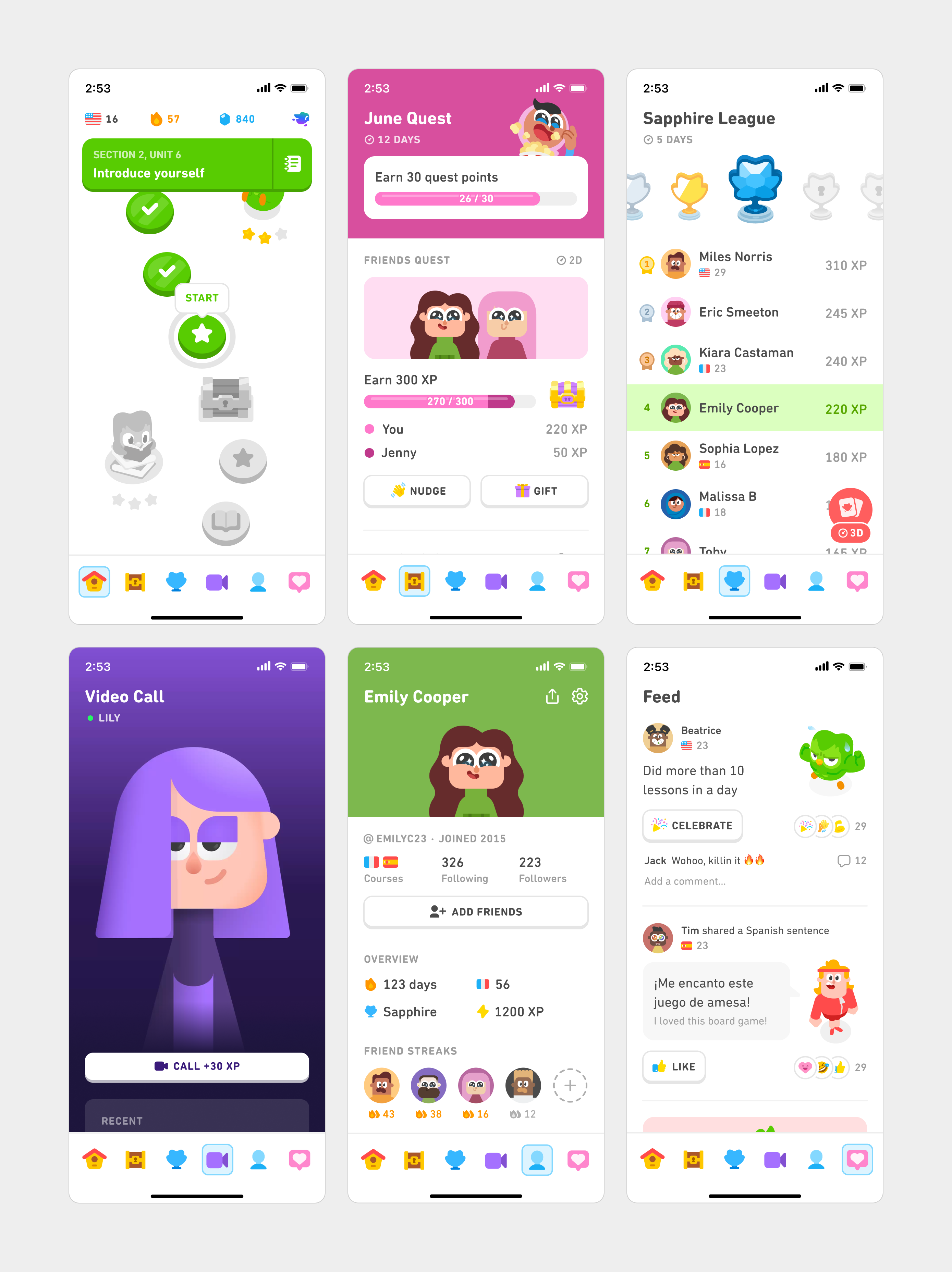
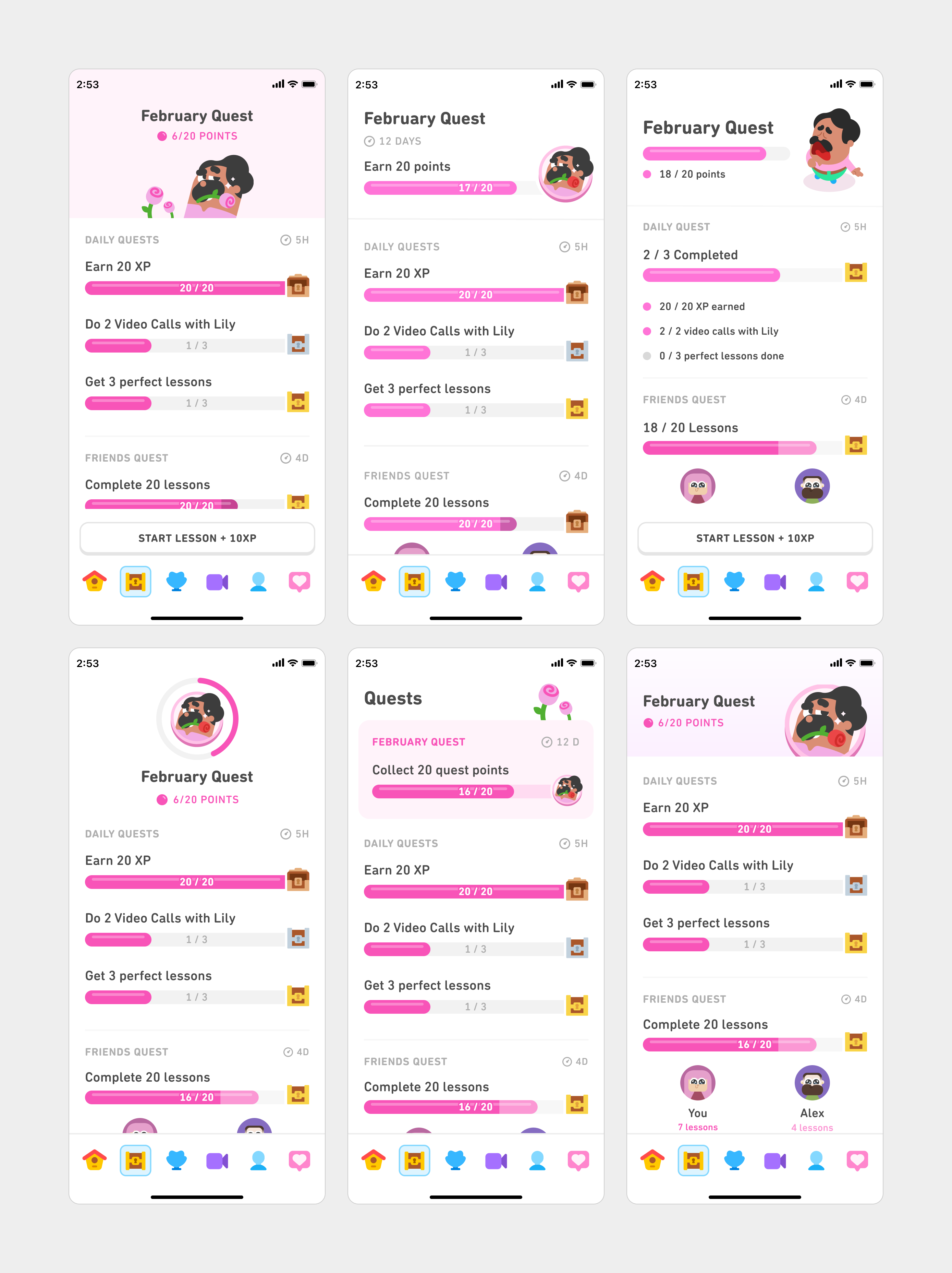
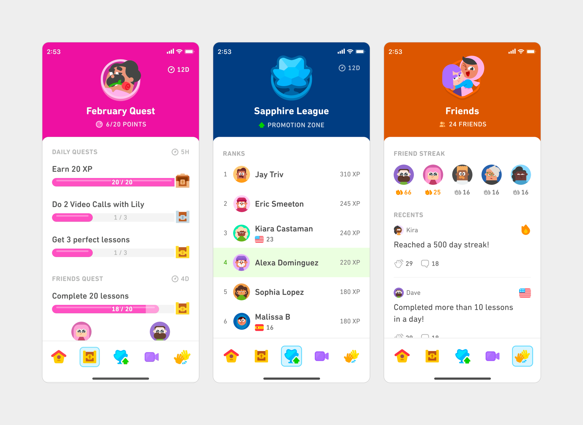
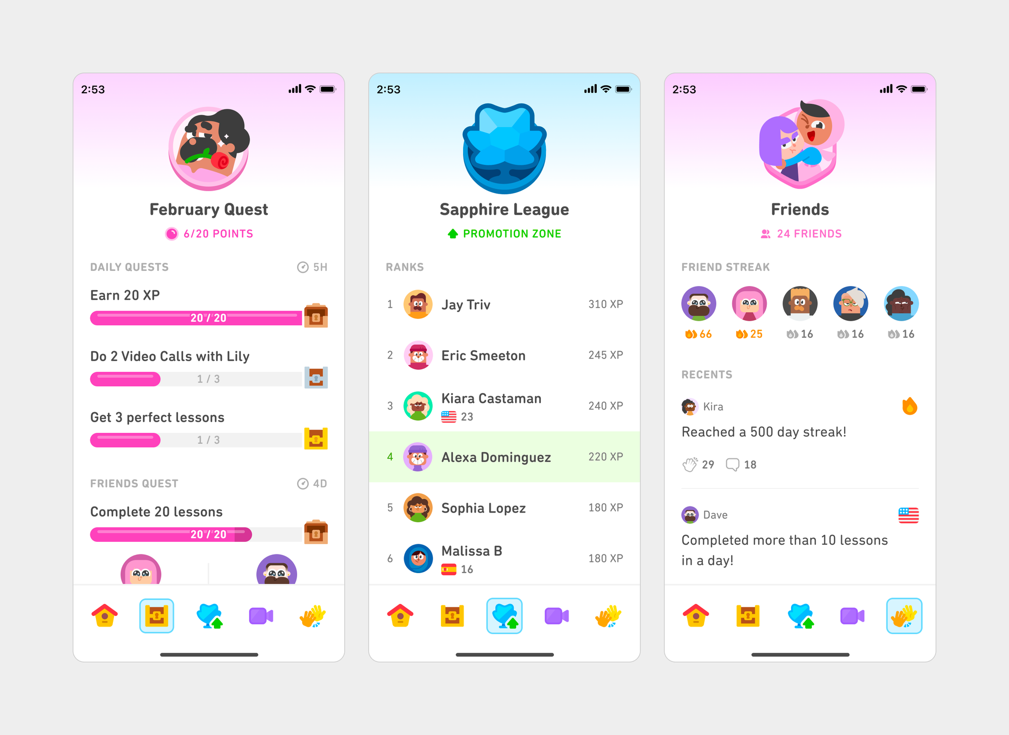
Over the years, we've developed new tabs to help learners stay motivated, get extra practice, and engage with each other. Each of these tabs worked fine on their own, but together they didn’t feel like part of the same family. Headers varied in size, typography lacked hierarchy, and spacing felt inconsistent.
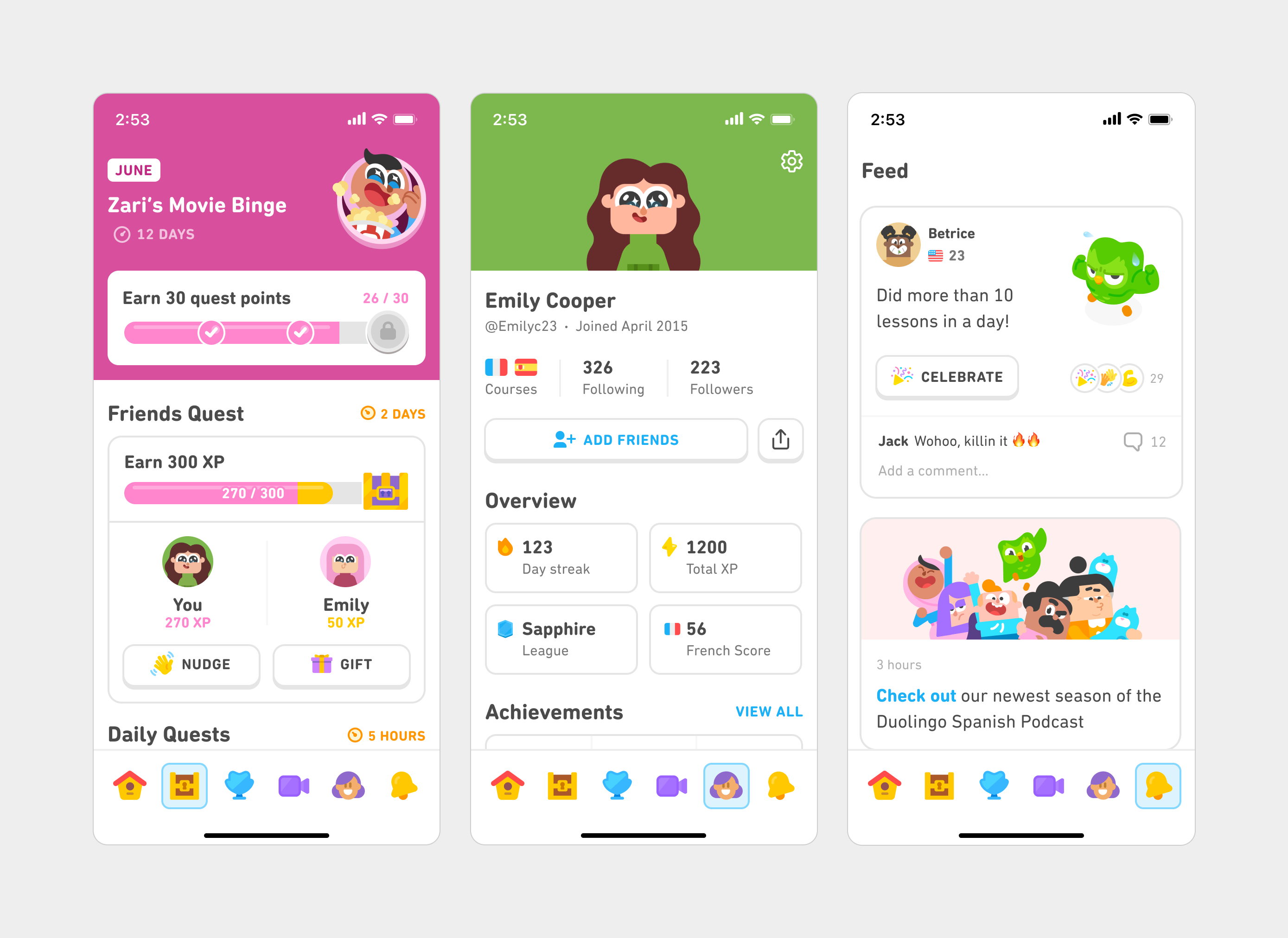
Eventually, these small details added up to an experience that didn’t feel polished and cohesive. We took this as a chance to refine the craft that shapes how our learners experience Duolingo every day by asking ourselves “What’s not working, and how can we make it better?”
Exploring bold ideas
Before getting into weeds, we gave ourselves some space to do a quick sprint where we suspended assumptions and went wild with quite a few divergent ideas for individual tabs
Then we tested scaling the most promising new directions. This helped us develop four distinct directions that pushed consistency and simplicity to their extremes:
1. Punchy: solid, vibrantly-colored headers
2. Soft: calming gradients and colors
3. Modular: card-based, flexible layout
4. Flat: minimal layout with heavy white space
At the end of the sprint, we brought these into quick, scrappy prototypes and aligned with our stakeholders. Testing these options on our phones, along with early feedback from around the company, helped us identify what worked and what didn’t to make these wild concepts a reality.
Bringing our vision to life
We learned there were competing demands across our tabs: Consistency was sometimes at odds with the purpose of the design and the information it conveyed, and simplicity was likewise in tension with clarity.
Consistency needs to be balanced with purpose
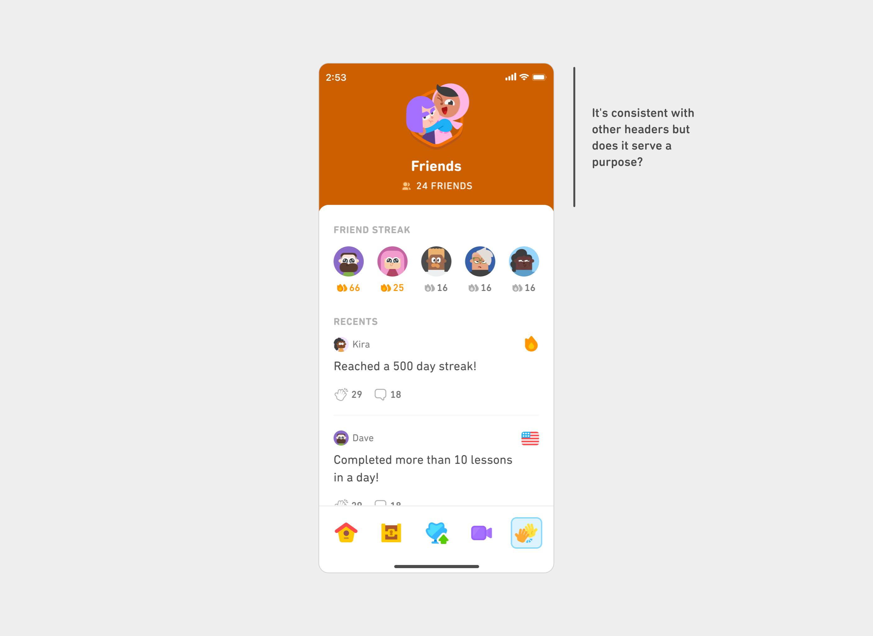
Without serving a purpose, tabs can lose their uniqueness and intentionality. For instance, using artwork in every tab header is consistent, but it can also feel forced, especially if it occupies significant space without signaling anything useful to our learners.
Simplicity needs to be balanced with clarity
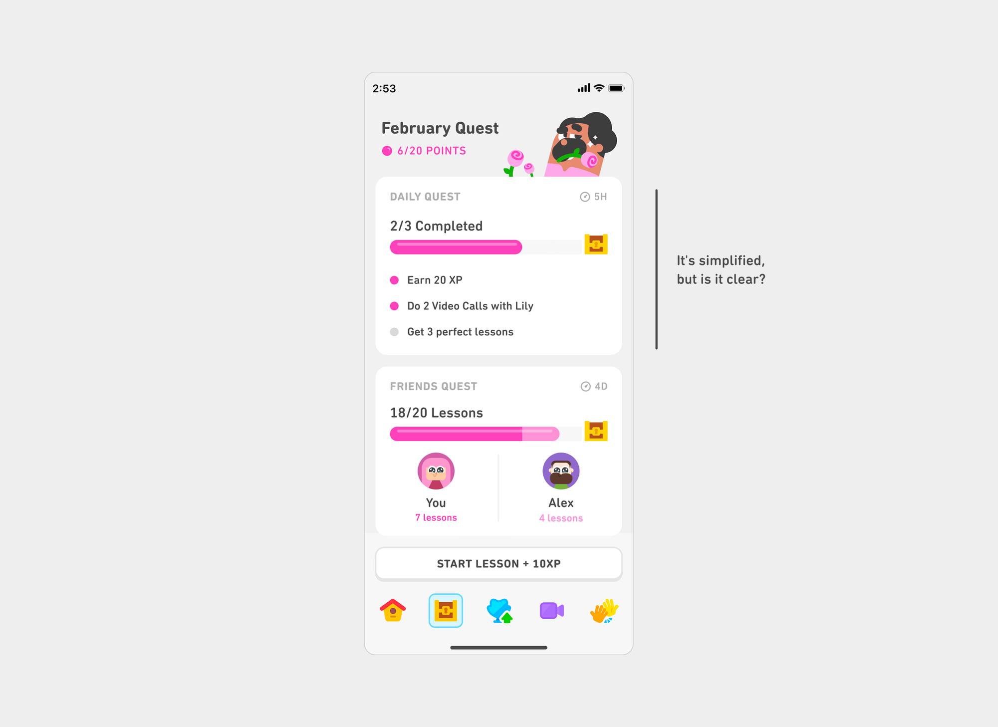
Similarly, simplicity is good but not at the expense of clarity. Good design means knowing what to remove and what to keep.
Building a system
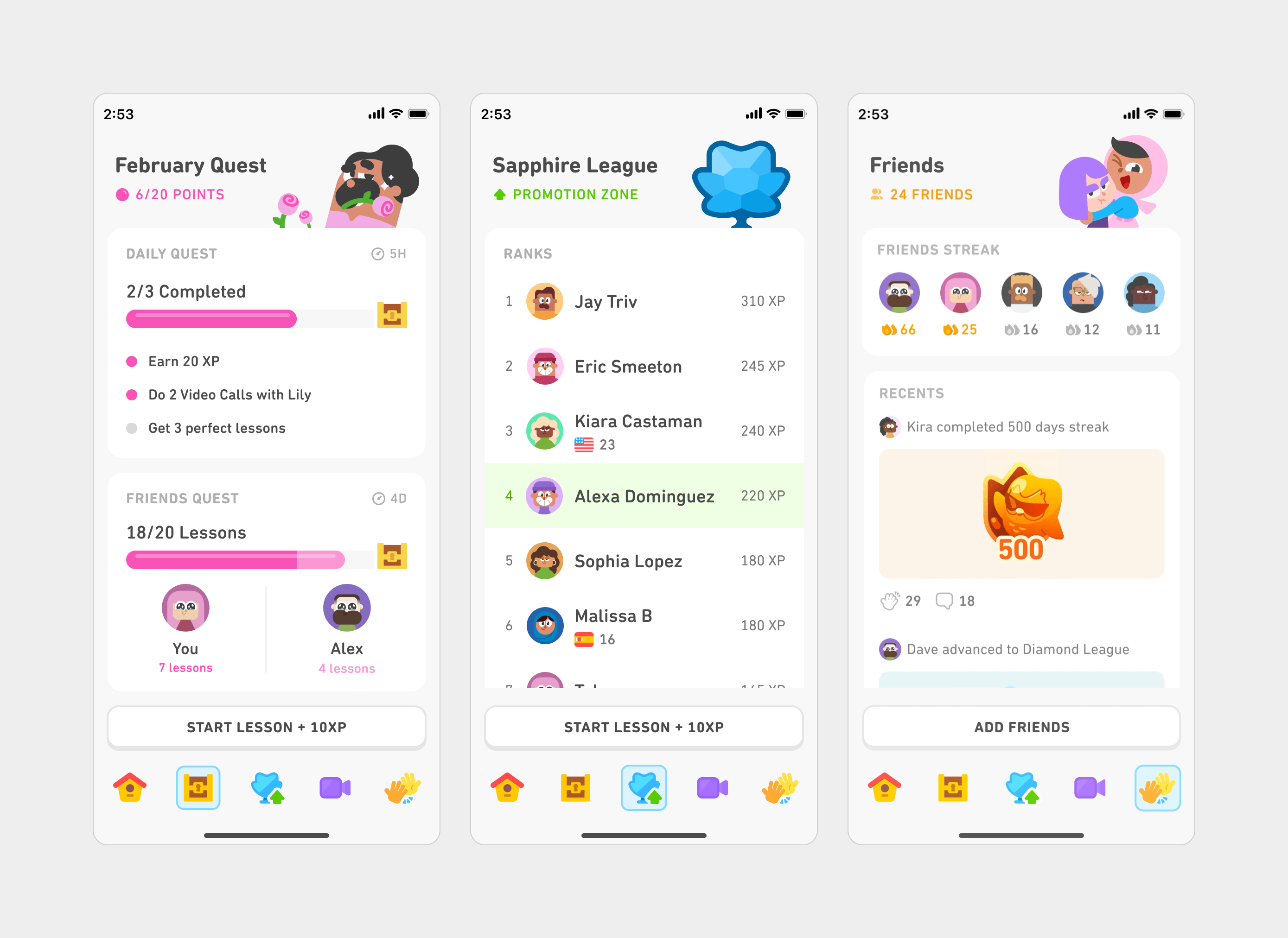
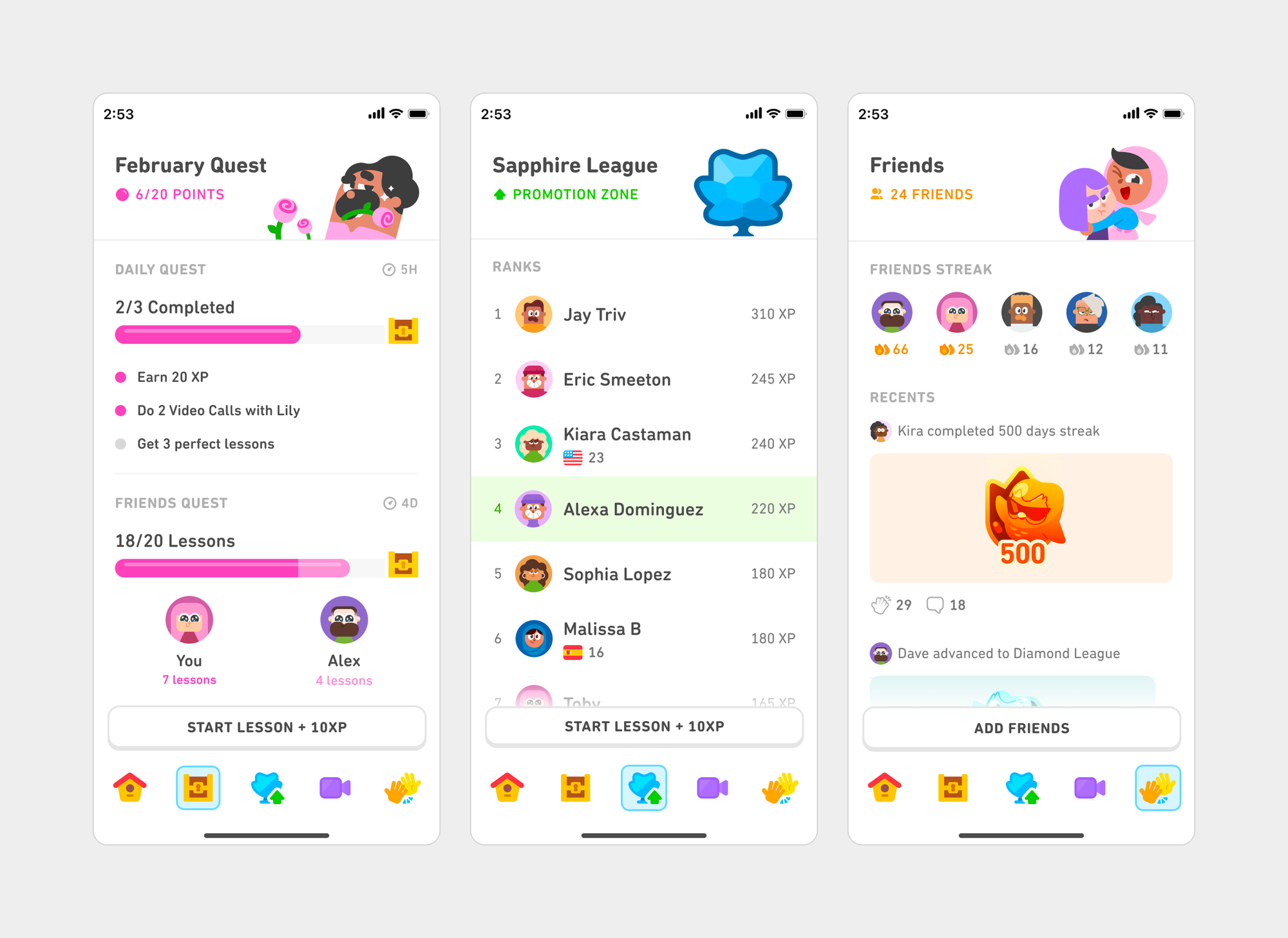
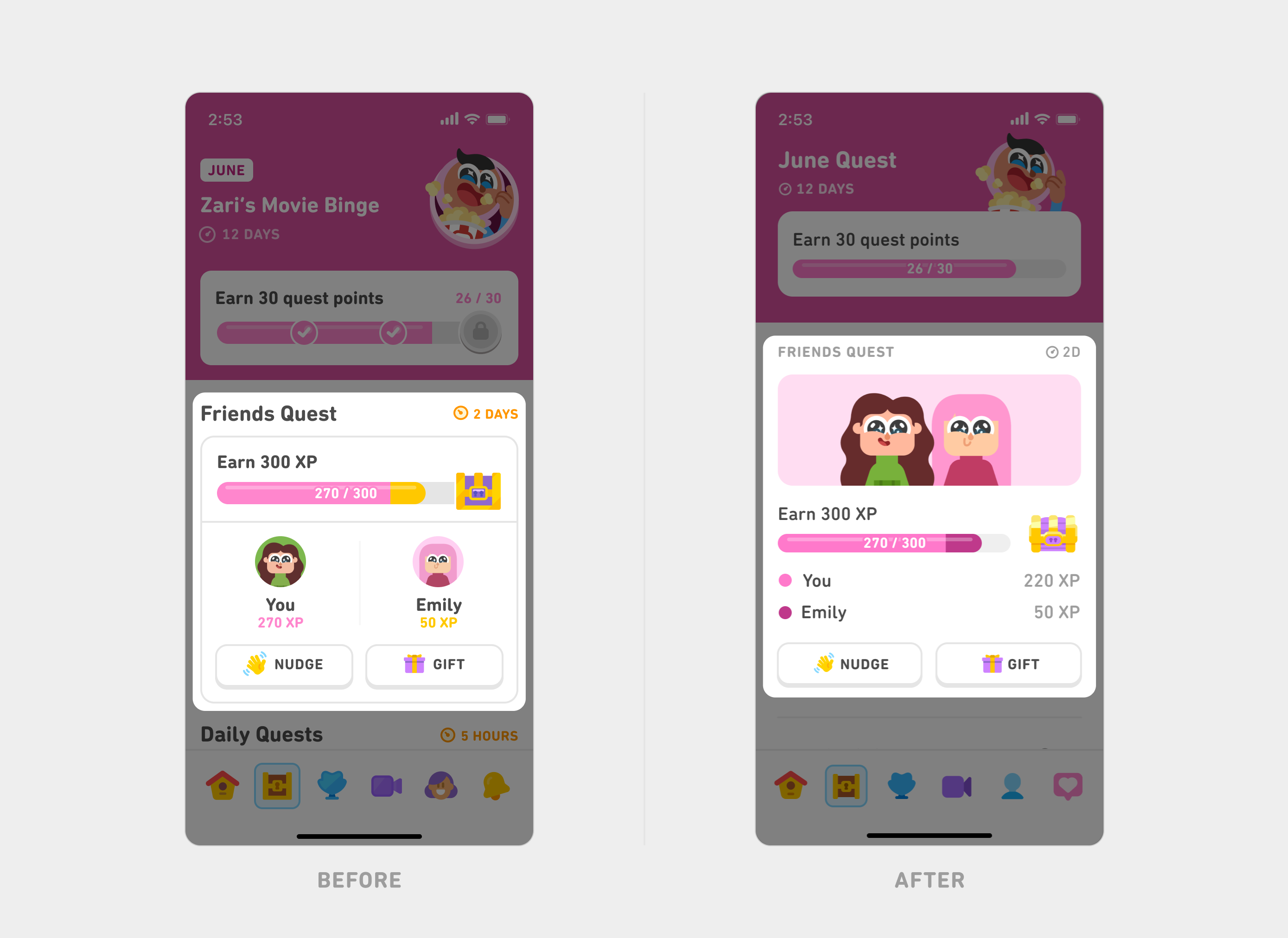
After aligning on our needs and priorities, we created a framework for all our design elements that could scale across tabs. For instance, for our headers, we created tiered sizes based on each tab’s purpose while keeping the titles consistently positioned.
Similarly, we evolved our type system to be consistent and intentional with a minimal number of styles. We also cleaned up our visual spacing by purposefully using the whitespace around the components instead of forcing containers around them.
By balancing consistency with purpose and simplicity with clarity, each tab shines with its own identity while still supporting a seamless, unified experience as learners move through the app.
Sweating the details
To bring our full vision to life, we closely collaborated with our engineering partners. This new cross-functional team was united by our deep care for craft and precision. Together, we developed QA processes to ensure a high degree of polish, including self-QA with design overlays. We also built on top of our already rigorous internal dogfooding culture across languages and devices.
Comparing the old tabs with our refreshed tabs makes clear that caring for small details and intentionality helps us bring a clean, consistent, and well crafted experience to our learners!
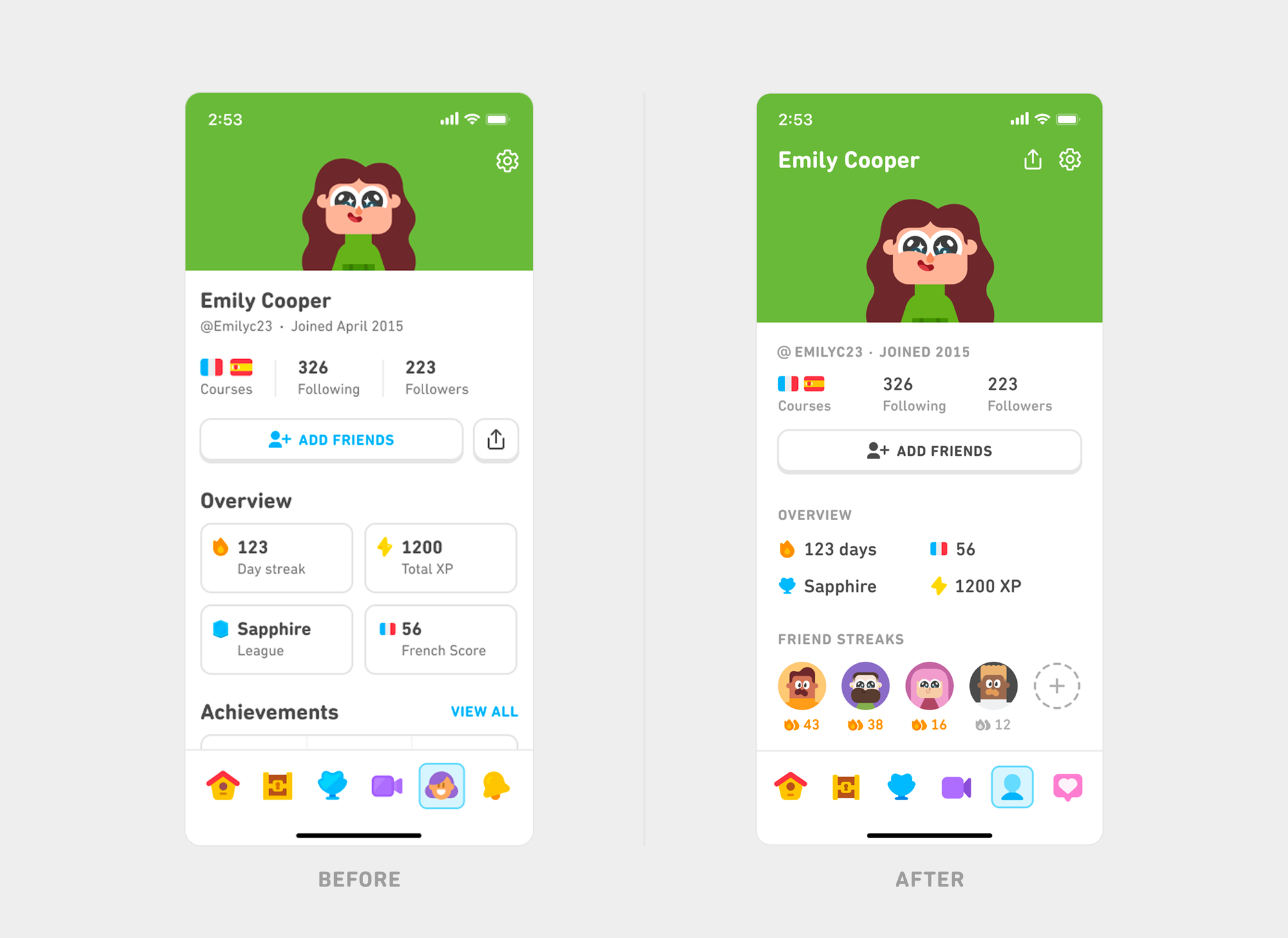
Our refreshed tabs recently went live on iOS and are coming soon to Android. The changes have been resonating with our learners as well: We see higher engagement across tabs while maintaining our core learning metrics.
What we learned about craft
Good craft is one of the key secret sauces behind Duolingo design: We envision what good could look like and refuse to settle. It calls for being relentless and obsessive about excellence, and when we're doing it right, it shines from the smallest of details to the highest tiers of the system.
It’s a mindset we carry into every part of our product, and we hope it inspires you to try the same. 💚