Duolingo has an important mission: to develop the best education in the world, and make it universally available. An essential element of “universally available” is providing a great learning experience regardless of location, device, or network connectivity. We especially care about our app size, which can affect how fast and easy it is to download and update our app, especially in regions with low bandwidth or expensive data plans.

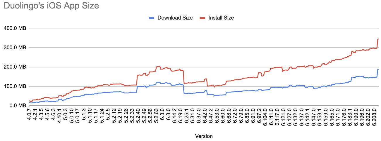
Since 2020, our iOS app has steadily increased in size, growing at a fairly constant rate of 50MB per year. We had believed that a lot of this increase was inevitable: the more features we added, the bigger the app would get! Starting with the release of Duolingo 4.0 on iOS in 2014, we tracked the download and install size of each version in a single spreadsheet. The goal was to spot jumps for our release managers to investigate. Unfortunately, with hundreds of changes in each weekly release, triaging and addressing regressions was a lot of work. To stop the gradual increase in app size, we realized that we needed to drastically improve monitoring and our ability to find the culprit changes.
While we briefly discussed extending our spreadsheet to run and report on every pull request, we realized that this would require a lot of bandwidth and resourcing. Instead, we opted to look for a partner to help us out and selected Emerge Tools!

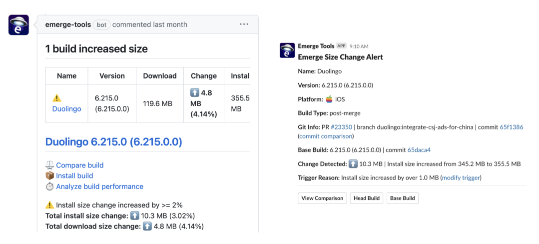
Emerge integrates with GitHub and Slack to make app size analysis easy and accessible. When a developer opens a pull request on GitHub, Emerge automatically runs a size analysis, and based on customizable thresholds, posts a comment with the results. The comment shows the size difference between the base branch and the pull request branch, as well as the size impact of each file change. We also configured the size analysis to send a notification to our iOS engineering Slack channel for the largest increases. This is incredibly valuable for getting all stakeholders (not just iOS developers) involved in the discussions around tradeoffs.

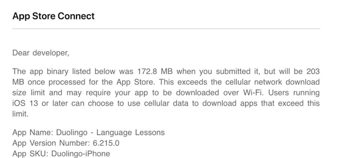
Shortly after our weekly release cutoff, we got a surprising email from Apple; our latest release candidate had crossed the 200 MB download size threshold and would now display a warning to users when downloading on a cellular connection.
This was uncharted territory: about a third of our new users installed Duolingo on cellular networks, and a warning message could discourage them from starting to learn a language with us. While we considered reverting as many of the recent changes as possible, we realized focusing on the latest regression would be shortsighted. We decided to take a closer look at what was taking up so much space in our app, and how we could reduce it without compromising on quality or functionality.

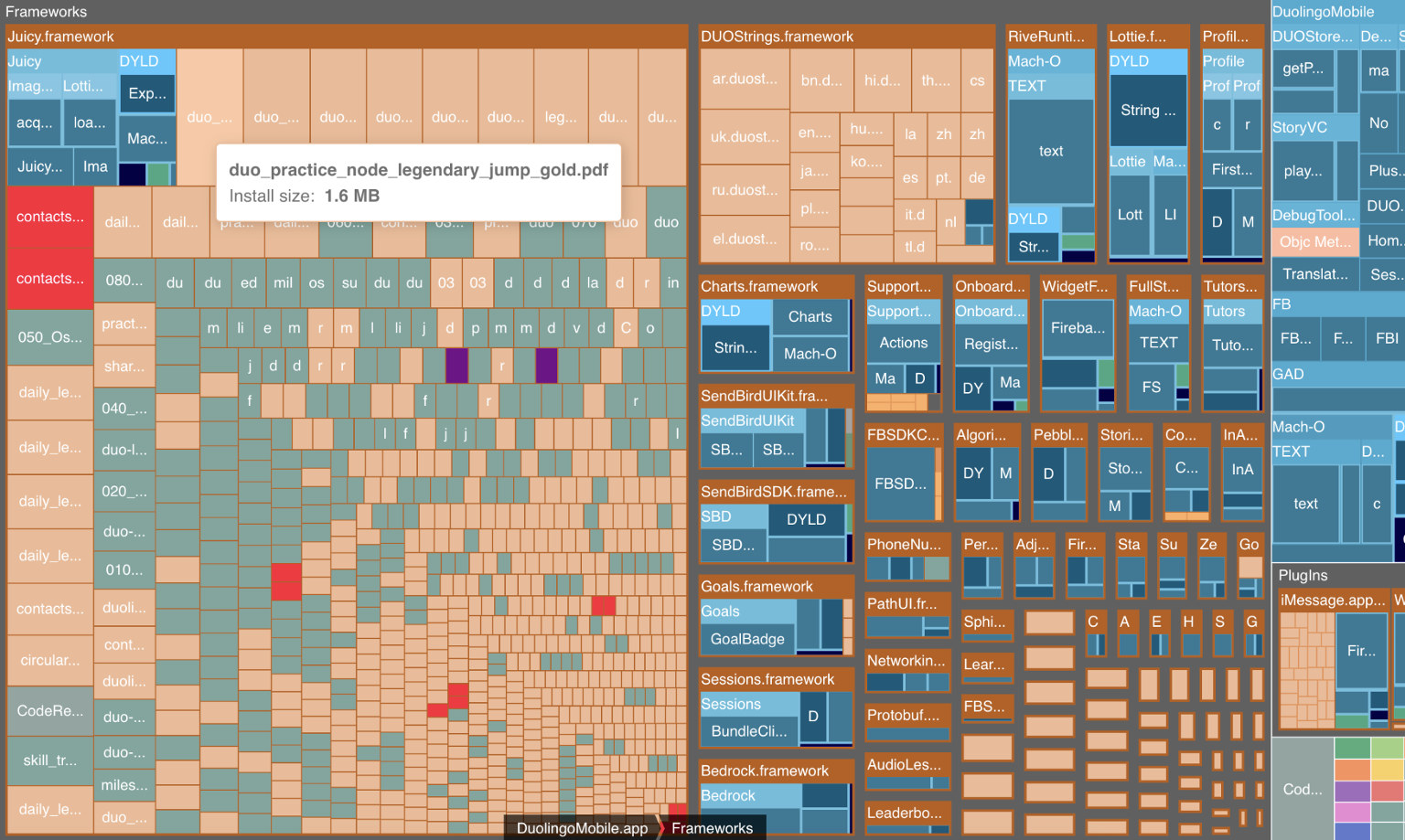
Emerge has a powerful visualization feature that lets us see how our app size is distributed across different types of data. We can also drill down into each category or framework and see the individual components that add up to the overall size. This helps us identify the biggest contributors to our app size and prioritize the areas that need optimization.
Just looking at the breakdown, it became clear how much of the app size is assets (32%)! While some of these are sound effects and animations, most are images. Outside of the images shown in lessons, we have historically bundled the vast majority of images into the app. There are tradeoffs, but this reduces complexity and provides a more consistent experience for those with a poor connection or using our app offline.
Plus, almost all of those images are PDFs. Years ago, we defaulted our asset pipeline to use vector images as the Duolingo art style (usually) compresses well and can render with no artifacts. However, the Emerge visualization illustrated how some of the PDFs were much larger than others. Digging into the worst offenders, we found a common trend among them: They all had gradients or blurs that exploded the size when exported from our art tools as a PDF.

For example, one of the screens for our Legendary feature was a 1.6MB PDF on iOS and just 19KB on Android. What was the difference? It came down to the type of glow surrounding the trophy. The PDFs were exported with a gaussian blur and the SVGs used a radial blur. We updated the source files to explicitly use a radial blur and reduced the PDF to 44KB. Updating all of our Legendary images saved over 10MB!
We looked at our Android app as a point of comparison and made another observation: There were over 1,000 more images bundled into our iOS app compared to our Android app. Over the years, we had accumulated a lot of images that were no longer needed or even referenced in our code but still bundled in our app.It was time for some spring cleaning. To do this, one of our engineers wrote a heuristic-based static analysis to identify unused PDFs based on the filenames referenced in code. If a PDF name did not match any image name, it was flagged as unused and marked for deletion. We found over 17 MB of unused images! There were a couple of false positives, but thanks to our robust beta program (come join!) we were able to catch those before a public release.

The last piece of the puzzle was to investigate the file types. We generally found that our SVGs assets were an order of magnitude smaller than the PDFs. We had been eyeing switching our PDFs to SVGs on iOS for a while but the initial rollout of native SVG support in iOS 14 rendered our assets poorly. Fortunately, iOS 15 does a terrific job of preserving fidelity and as of this month we are requiring iOS 15 or above now that 99% of Duolingo users meet that threshold. We estimate switching most of our vector images from PDFs to SVGs will save us another 50MB.
We learned a lot from our efforts to reduce the size of our iOS app! Although we made a lot of changes to our development processes, the key enabler was actionable, automated monitoring to identify and address the sources of growth.
Interested in solving problems and pioneering solutions with us? Join our team!
