
Before I joined Duolingo, I asked one of my interviewers, “What kinds of tools do you use to analyze data?” When I was told that Duolingo creates their own analytics tools, I was skeptical. I had worked at Spotify and Facebook, which had giant teams dedicated to creating custom data tooling, and I expected Duolingo’s to be rudimentary compared to those.
But when I finally got to see the tools for myself, I was blown away. Not only were they just as powerful and flexible as the tools I used at previous companies, but they were even easier to use.
Here’s a quick look at just some of the features.
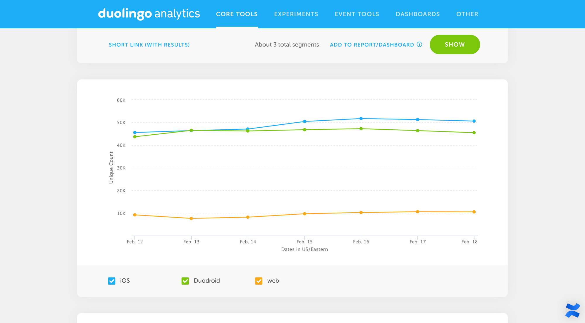
Segmentation
This is one of the main tools we use to pull data. It’s pretty self-explanatory: you just specify the data point (i.e. tracking event) you want to see, along with any filters and properties to segment the data...
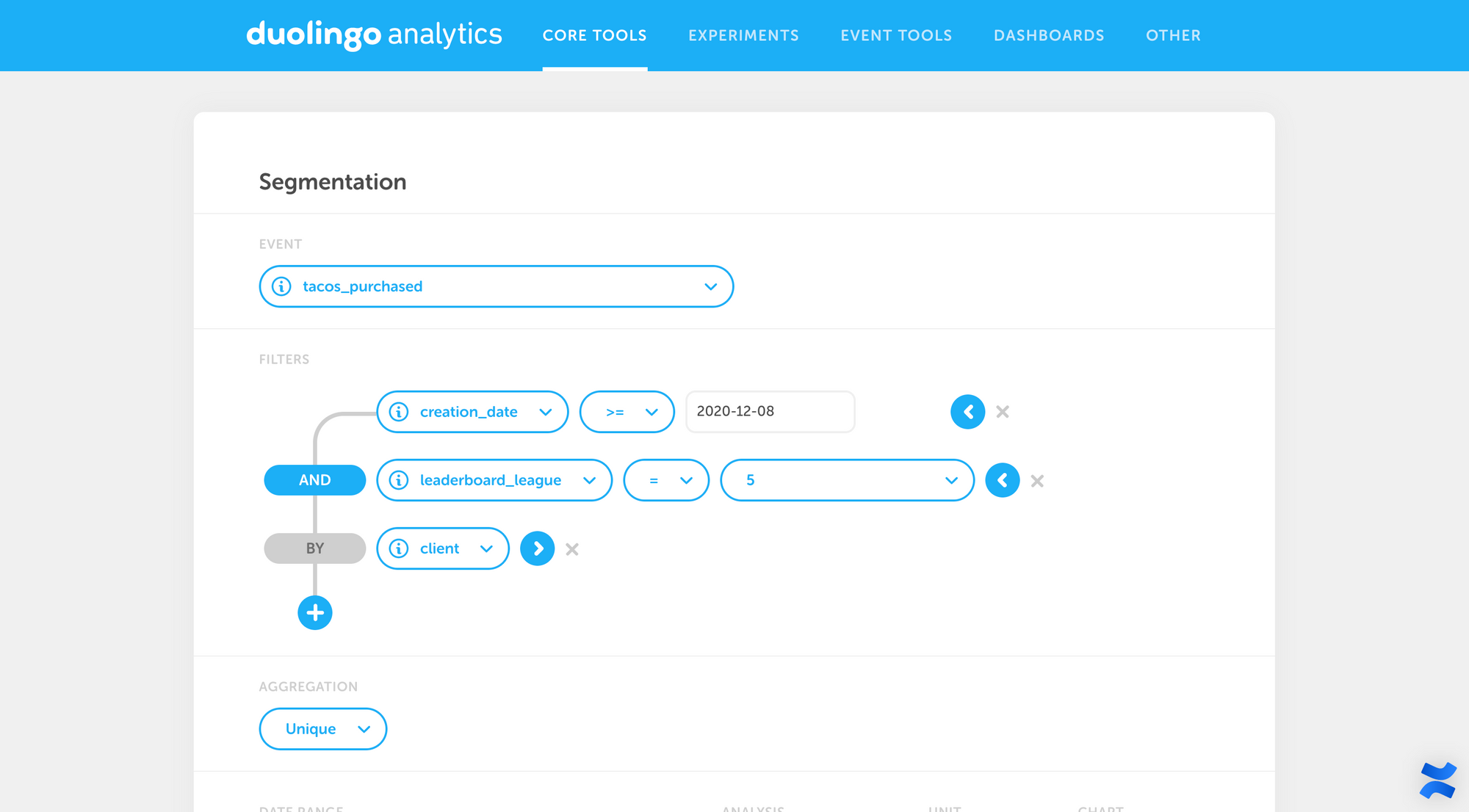
...and voila, a beautiful graph!
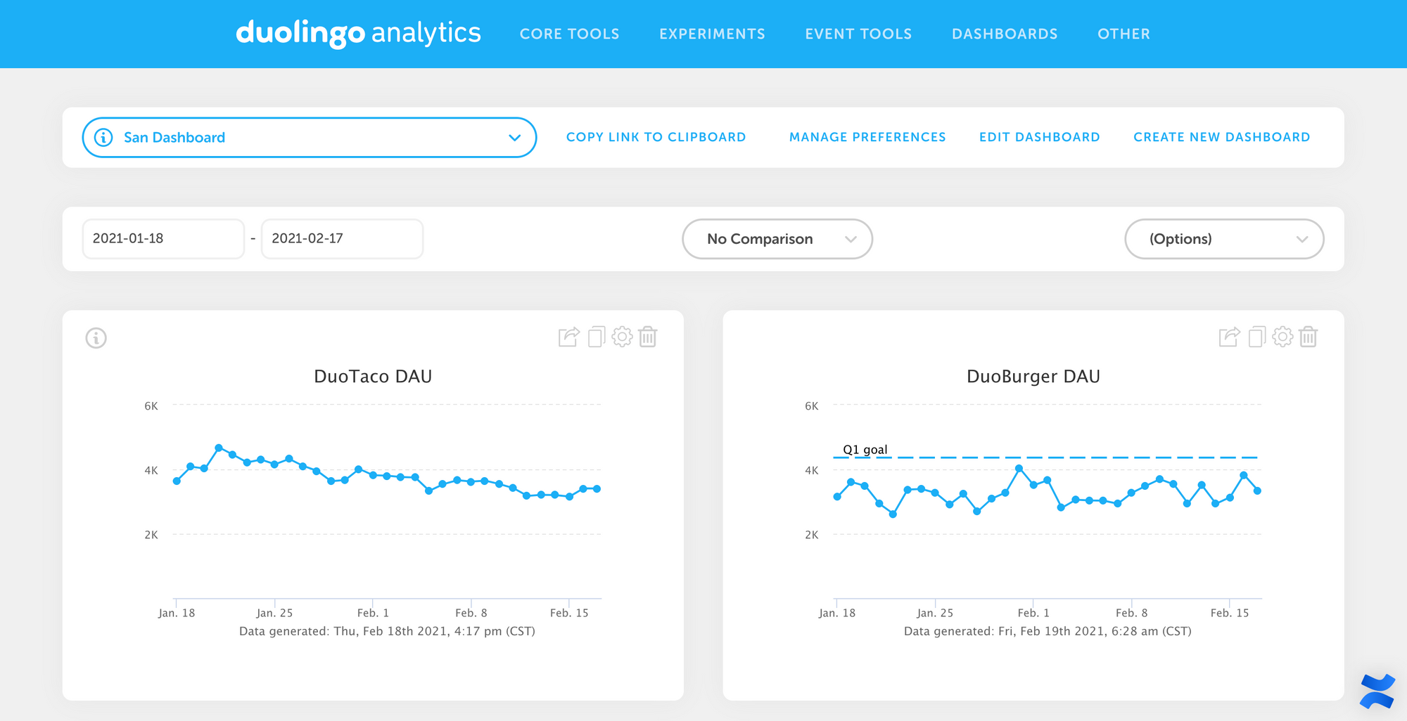
Dashboard
As you start creating graphs for the data that you care about, you can aggregate them into a custom dashboard that shows multiple data points at a glance.
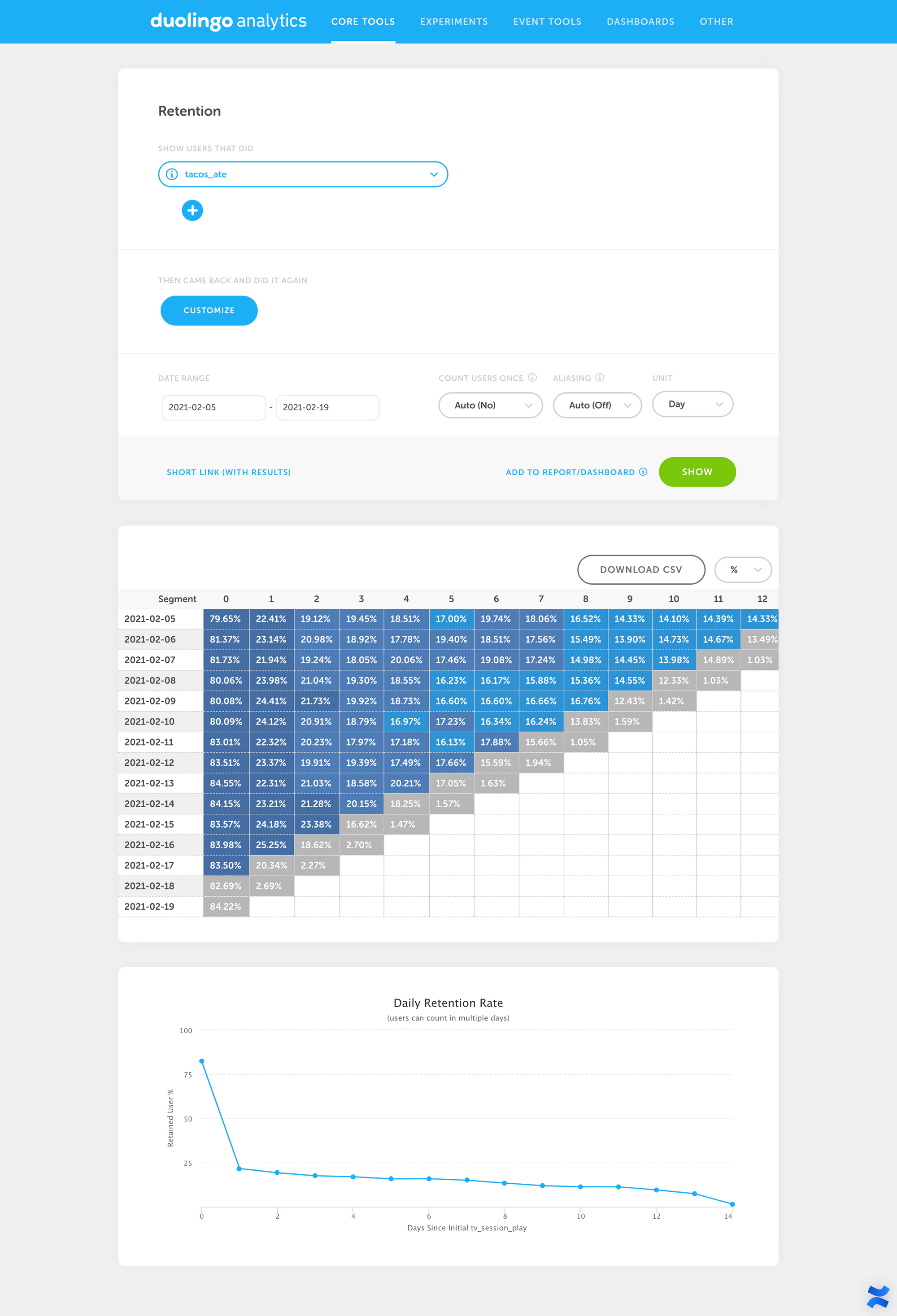
Retention
We also have a dead-simple tool that shows daily/weekly/monthly retention in both table and graph form:
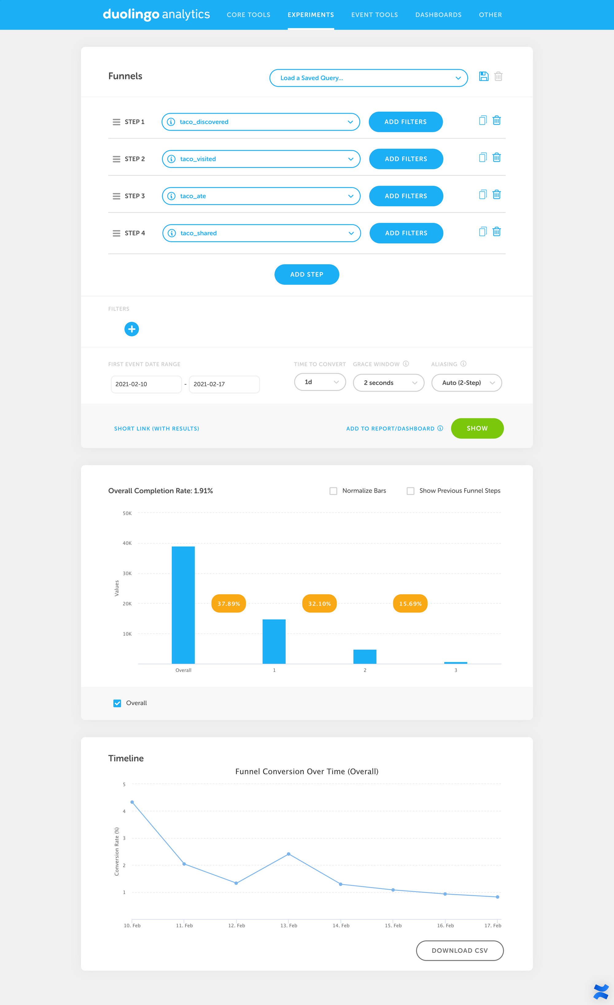
Funnel
We can create custom funnel analyses by entering in multiple events that make up a funnel in the user flow:
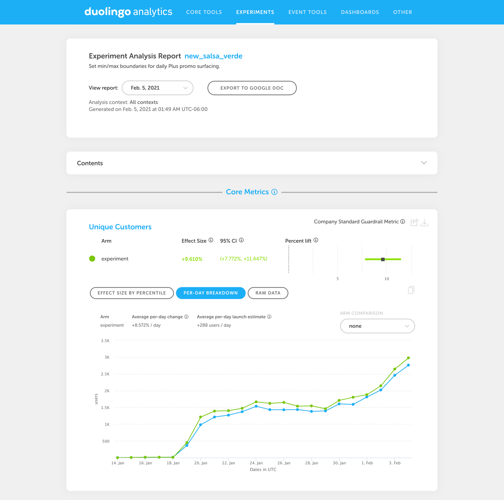
Experiments
We also have an entire suite of tools for running and analyzing A/B tests, which we covered in a separate post. We run thousands of A/B tests every year at Duolingo, and these tools make it easy for us to visualize the impact each test has, complete with confidence intervals (to show uncertainty in our measurements) and graphs over time.
After almost 2 years at Duolingo, I’m still amazed by how powerful and beautiful our data tools are. A big shout-out to the incredible Analytics team at Duolingo, who makes all of this possible!
If you’re curious to learn more, we’re hiring!