At Duolingo, we believe it’s important to use data to drive our decisions. This includes decisions about how best to teach languages. You probably aren’t thinking about it while you’re doing your daily Spanish lessons, but in the background, we have dedicated teams of volunteers and staff working on improving the courses we teach you and developing new versions of the courses, which we call “trees”. Once these trees are done, we release them as A/B experiments to a portion of learners and track the impact on engagement with the app. This lets us ensure that the changes we made would actually be beneficial to the learning experience on Duolingo.
However, one downside to this approach is that it is a very retrospective measure: it gives us information on how a tree performed after we have finished making changes. But what if we wanted to see how we’re doing on improving a course while we’re still working on it?
The problem: lack of sufficient data and metrics for Duolingo course contributors
Both our internal language experts and our volunteer contributors who create course content had ideas and opinions about what works and what doesn’t, but we didn’t have very detailed information about what kind of content actually drives the success of a course as a whole. We felt this was an important problem to solve, one that is critical to the course creation process.

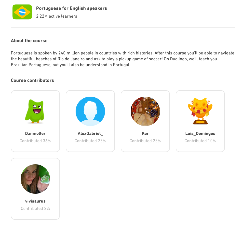
(Protip: if you go to https://www.duolingo.com/courses/ and click on a language, you can see which contributors to thank for bringing you the original content of the course! For example, here’s the page for Portuguese from English.)
Without data to guide their decisions, course creators could find themselves in the unfortunate scenario where they’ve poured a lot of time into a tree that eventually does not perform as well as it could, without really understanding the underlying reasons. This summer, I had the opportunity to develop course quality tools to help course teams make successful courses from the start.
Previously, one step that Duolingo took to give our contributors the tools to improve their courses was the course quality metrics. These were developed as aggregate measures of factors that had the highest impact on course engagement. Not only do we use these measures internally, but we also give contributors access to them. We also provide course creators with recommendations based on these metrics. Earlier this summer, I worked on making these recommendations more personalized, so that if a particular tree was, for example, performing well by having a good number of lessons in each skill, course creators wouldn’t be encouraged to overpack skills with even more lessons.
The solution: introducing the Tree Filter!
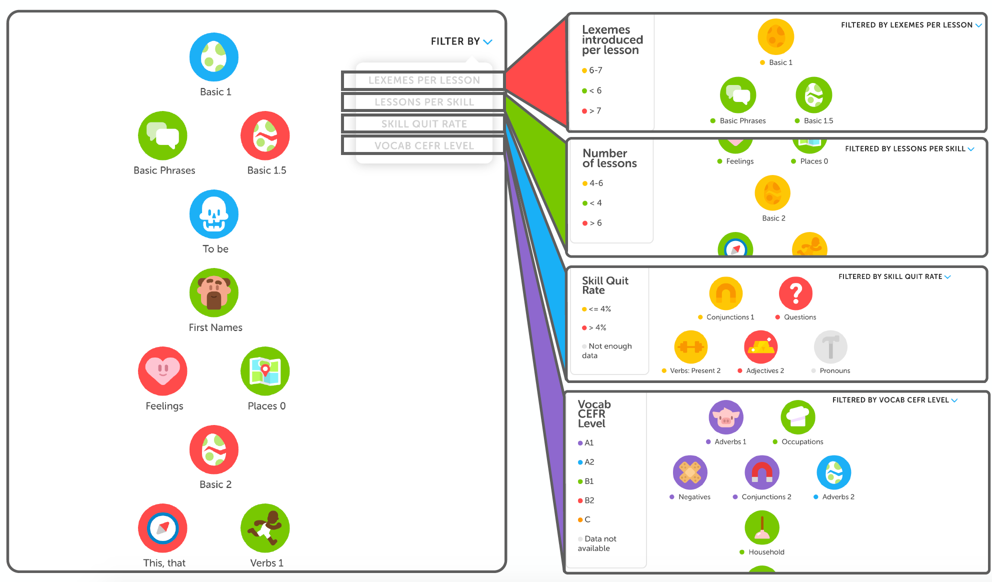
Having these aggregate measures of course quality was useful for getting an overall sense of whether or not courses are heading in the right direction. However, there wasn’t a good way of getting more granular data on direct steps contributors could take to improve their trees. To address this, I worked on developing the Tree Filter, a new way of letting course contributors look at the skills in their trees and color-code them according to different metrics.

(On the left, you can see a view of how the Tree Filter tool would look to a course creator. On the right, you can see snapshots of how the tree could look when filtered by the four filters.)
I implemented four filters for this tool:
Lexemes per Lesson: This measures the average number of vocabulary items taught in each lesson of the skill. We’ve found that keeping this number between 6 and 7 is optimal for making sure that each lesson has enough content, but not too much content.
Lessons per Skill: This measures the number of lessons in the 0th level of each skill. Again, we’ve found that there’s a sweet spot between 4 and 6 lessons for this metric.
Skill Quit Rate: This is a measure of how often users quit out of each skill. It is meant to indicate which skills may have certain problems that cause learners to quit out of them.
Vocab CEFR Level: Bozena Pajak, our Head of Learning Science, recently wrote about how we aligned some of Duolingo’s courses to the CEFR scale. The idea of this filter is to support our goal of working towards CEFR-aligned standards by looking at the different vocabulary items that are introduced in each skill, and color-coding skills based on the CEFR levels of the vocabulary. Course creators can also hover over skills to see which words have higher CEFR levels, so they can decide whether those words belong in that skill, or would be better moved further down the tree.
What was the impact?
For what I thought of as a relatively simple tool, the Tree Filter had a large impact on the tree developing experience, from beginning to end. The Tree Filter was one of the most-used course creator tools for tree development and revision.
It was also useful for analyzing the results of tree experiments, allowing staff and contributors alike to quickly see crucial differences between different versions of the same course and explain why some versions performed better than others. In addition, there’s a lot of potential for the skill filter to reveal correlations between different factors that could impact course quality.
Most importantly, I believe that the implementation of the Tree Filter tool has set the groundwork for adding more filters in the future, so if at some point we find a metric that really impacts a course’s quality, it should be relatively easy to add it as a filter.
Unless you’re a course creator, you probably won’t notice this tool directly or even get to see the Tree Filter. But it will be there, and we hope it will continue helping course creators develop even better courses for you to enjoy.
