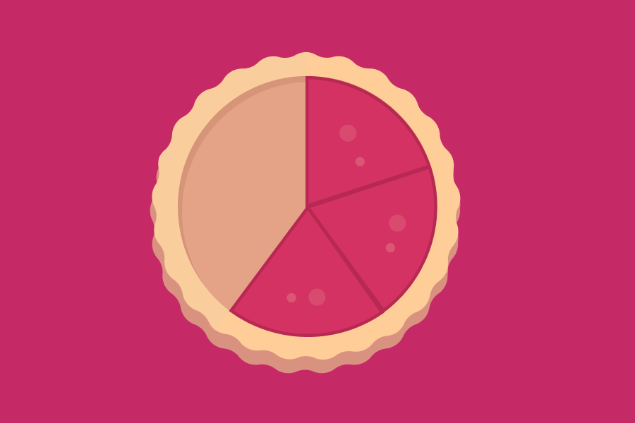
Charts and graphs bring numbers to life—and what's more crucial to life than food?! There's one chart that has earned a delicious name nearly worldwide: the pie chart! 🥧
Each percentage of a pie chart is represented by a different color or pattern, giving the appearance of slices, wedges, or chunks… and they remind many of us of our favorite snacks.
Pie charts carry the sophisticated name الدائرة النسبية in Arabic (al-da'era al-nesbeyya, or "proportionality circle") and are known straightforwardly as a circle chart or graph in Japanese (円グラフ, en gurafu), Polish (diagram kołowy), and Thai (แผนภูมิวงกลม, phaenphum wongklom)—but you'll find many tasty options, too!
Languages that make it as easy as pie
English isn't the only language that calls these little slices a "pie" chart: This food is also used in Czech (koláčový graf) and Greek (διάγραμμα πίτας, diágramma pítas). Tagalog borrowed "pie chart" right from English, and gráfica de pie (pronounced like English "pie") is one of several options in Spanish, too.

Names that really take the cake
Many languages call this graph a "cake" chart: It's diagramma a torta in Italian and pasta grafiği in Turkish. (Pasta means "cake" in Turkish!) German and Spanish have more formal, circle-based names, but you'll also hear the cake names Tortendiagramm in German and gráfica de pastel in Spanish.
One name that is a bit cheesy
You won't be surprised which language uses a cheese-based name for these graphs: French! Although they can be called un graphique (a graph) or un graphique circulaire (a circular graph), the most common name is un camembert. C'est magnifique !
Inspiration from a savory slice
In China, there's a different kind of food known for slices. The savory pancake is the namesake of these charts in Chinese: 饼图 (bǐng tú).
And finally: a name that everyone will love
In Portuguese, the name for these charts is based on yet another kind of edible slice: pizza! You'll use gráfico de pizza for "pie chart" in Portuguese.
Just a *fraction* of what makes math fun!
No matter which way you slice it, these charts are a fun way to visualize data! For more practice with percentages and fractions, try Duolingo's new math course!
