As some of you know, we're working on redesigning the look and feel of Duolingo across all of our platforms. Our iPhone and iPad apps already have the new, cleaner design (which received a lot of love from Apple!), and over the next few weeks the other platforms, including this website, will also be upgraded. Our goal is to have a single consistent design that makes Duolingo look the same regardless of where you use it.
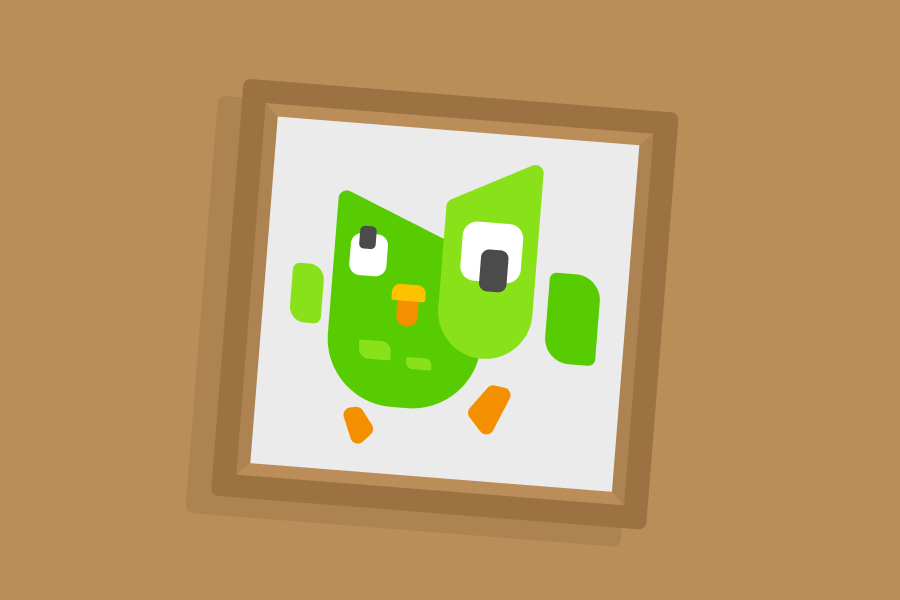
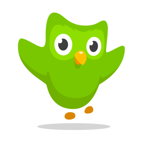
When we decided to redesign Duolingo, we knew we wanted Duo to come along for the ride. But in order for that to happen, he would need to undergo a few stylistic changes to fit our new vision. Firstly, we laid down a few ground rules: we knew Duo's color and his species (a very rare green owl) were not going to change. We also wanted to depict him as the same ol' Duolingo mascot that has been with us from the beginning, but with just a few cosmetic changes.
The most important part of Duo's reshaping was, obviously, Duo's shape/silhouette. In icon design as well as character design, if the overall shape is not appealing, then the details within that shape can't compliment it successfully. This process allowed us to explore lots of possibilities for Duo.
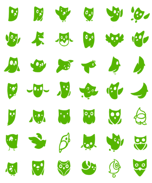
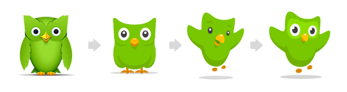
Iterations were made for months, some drastic, some minor. Each day, the progress was shown to the rest of the team. Based on the feedback given, Duo would either undergo another round of sketches, or proceed to a revised draft, where a vector image was made. Sometimes we would need to see him in his completed form to really know if he was the right direction to go.
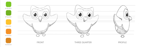
Once we reached a shape we were happy with, we added movement and even let him pick his best angle at a slight quarter-turn.
We're very excited to reintroduce you to Duo! We hope you love him as much as we do.
You'll be seeing him a lot more in the next few weeks as we incorporate him into many more places.