When it comes to character design, it is important to consider how a character may be perceived by a global audience. Our goal for Vikram’s redesign is to make the Sikh community feel seen by improving his look to feel more authentic, and to refine his shape design language to be more on brand with our style.
Step 1: Identifying problematic stereotypes
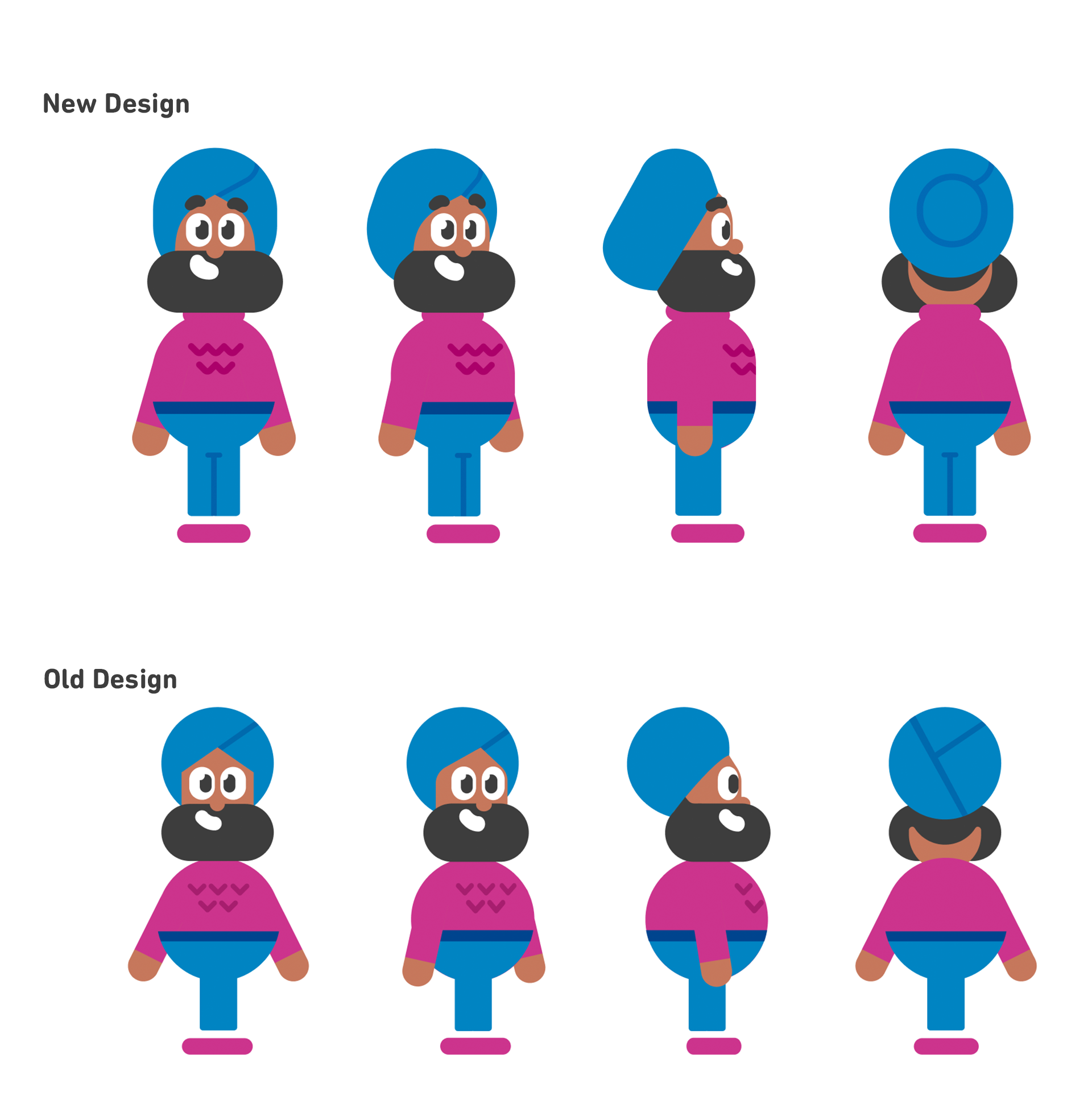
We received feedback that Vikram’s torso, which is basically a sphere, was evoking a “jolly and big belly” feeling similar to Santa Claus. This, combined with his illustrations often being food-related, resulted in a Sikh stereotype perceived as harmful in South Asian media. We met with a Sikh sensitivity consultant as well as a committee of South Asian Duolingo employees who volunteered their time to help bring to our attention some problematic stereotypes in Vikram’s existing design.
Step 2: Researching positive stereotypes
Our committee of South Asian Duos helped us find examples of Sikh men in popular media who are portrayed as confident, hardworking, academic, and capable. Having these positive examples of Sikh men was very helpful in redesigning Vikram to feel more authentic to real life. We loved finding inspiration from our favorite Sikh celebrities, like Diljit Dosanjh and Waris Ahluwalia!
Step 3: Redesigning Vikram’s body shape
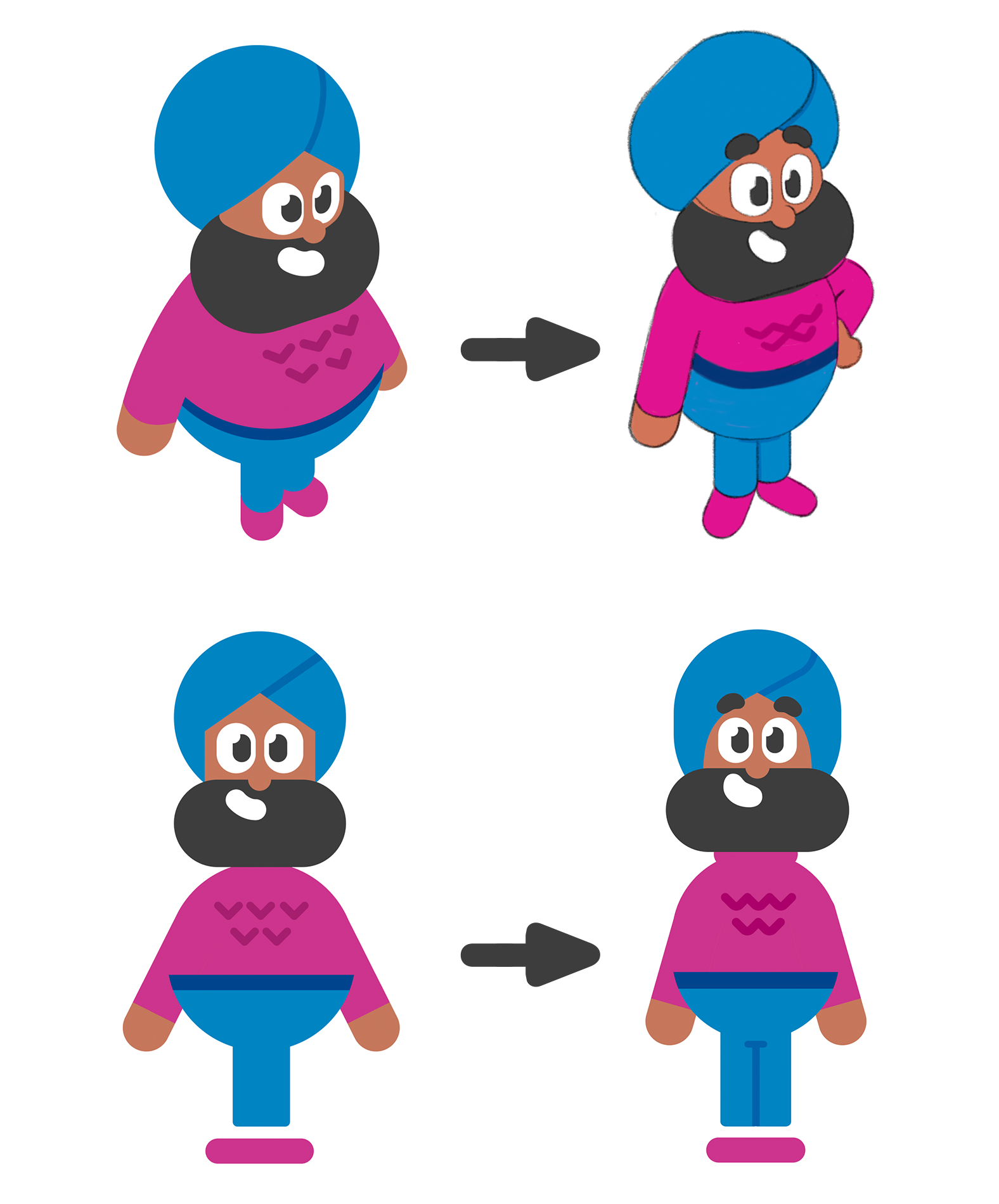
When designing a character, it’s important to know that certain shapes can suggest details about a character’s personality, for better or for worse. For example, large, blocky arms might imply that a character is strong, but it could also imply that a character is rigid or unmoving. When we first designed Vikram, we used a lot of circles to imply that he is friendly and approachable because circles are soft. However this also may have given the impression that he is big bellied, jolly, or lazy.
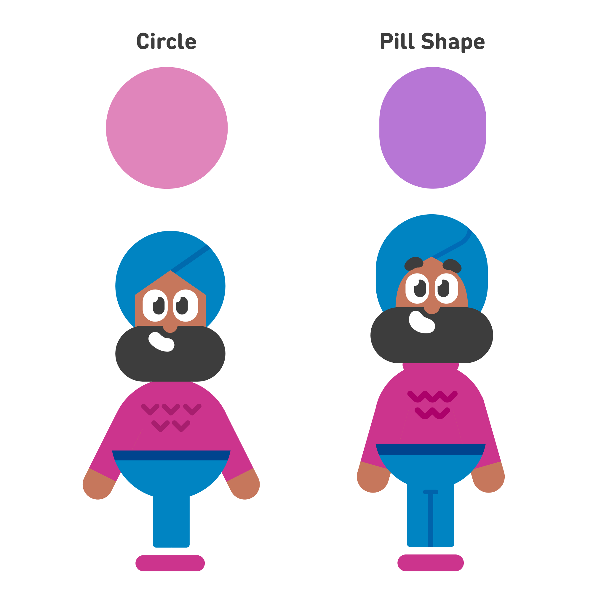
Keeping this in mind, we altered some of Vikram’s shapes, like his turban and his torso, to achieve a more inclusive design while also staying true to our design language.
Step 4: Iterating and Refining the Design
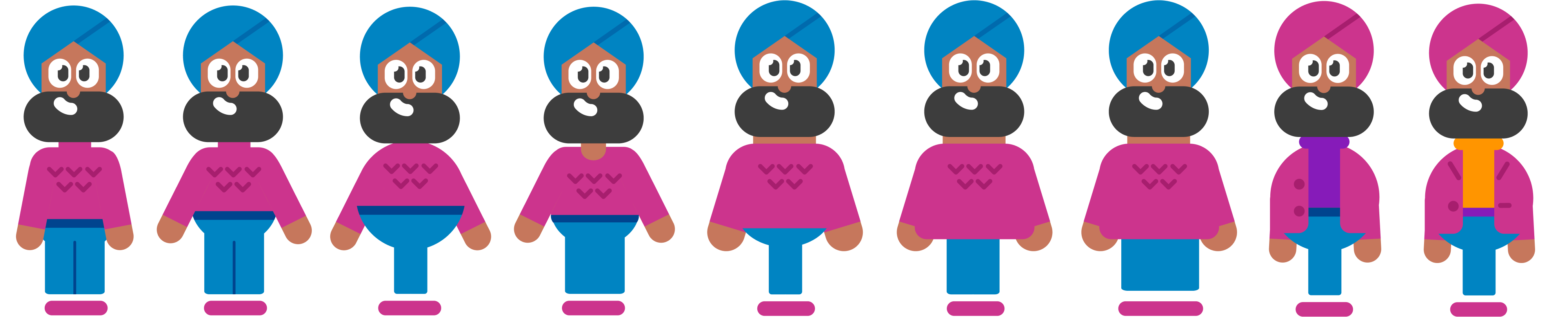
Once we had a rough idea of what the redesign might look like, we began iterating and refining the look. This involved tweaking aspects of Vikram's body, colors, and outfit. Even small changes have a big impact on how a character is perceived, so we experimented until we found a design that works. During this step we often checked in with our sensitivity consultant to make sure we were on the right track.
Step 5: Finalizing the redesign
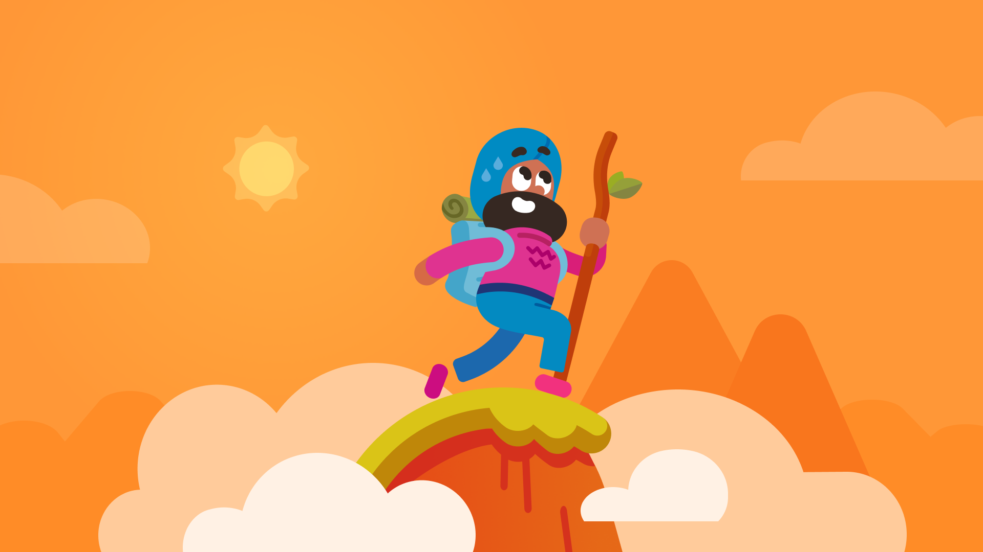
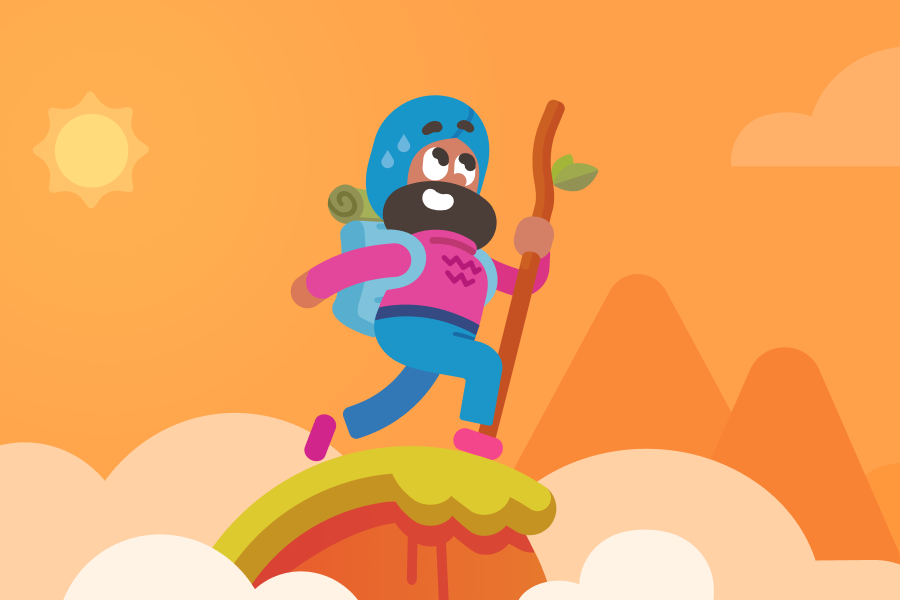
Finally, once we were happy with Vikram, we finalized the design and prepared it for use in creating new artwork, updating any existing animation, and marketing materials. Though we won’t be able to update every past instance of Vikram in the app, learners can expect to see the redesigned character going forward!
Our mission is to provide the best education in the world and make it universally available. To do this well, we also want to reflect the diversity of our learners all around the world. We aim to design our diverse cast of characters to feel respectful to culture and unique as people (or bears cough cough Falstaff cough cough) to keep our learning experience both entertaining and true to life.