Our artists wield a couple of tricks for making designs that simultaneously entertain and educate. This is a glimpse into our visual toolbox!
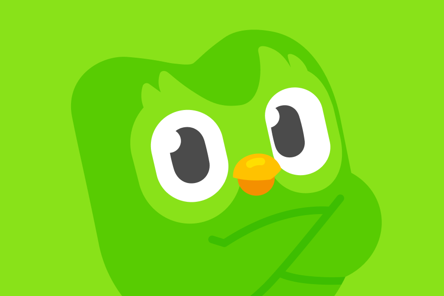
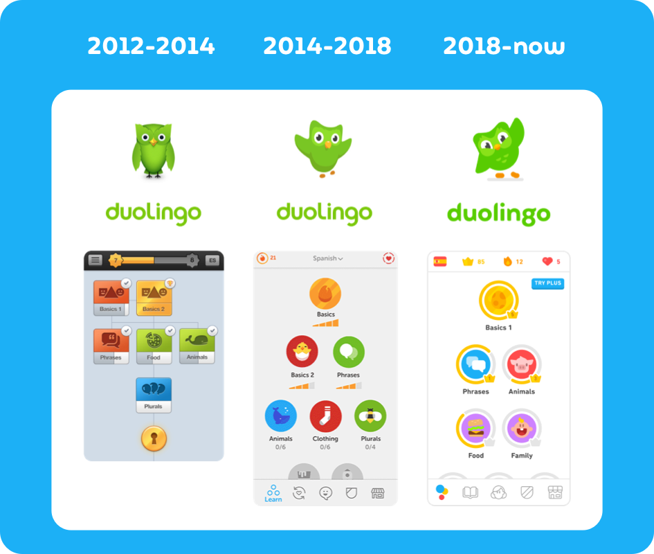
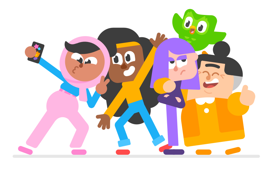
These days, you can probably pick a Duolingo design out of a lineup. It’s bold, bouncy, and bright—but it wasn’t always this way. Our early designs consisted of static, hard-edged shapes on a light gray background. Then in 2018, when Duolingo started work on a separate app called Duolingo KIDS, the art team began experimenting with brighter, rounder, friendlier illustrations appropriate for a younger audience. This illustration style soon made its way over to the main Duolingo app, and the app’s UI followed suit with a big redesign in 2018 characterized by vibrant colors and rounded buttons on a white background. This marked the full evolution from flat, pointy shapes and muted colors to our current aesthetic that Duolingo fans now know so well.
Through years of experimentation, we’ve learned what visual traits work best for our learners and for our art team. It’s a minimalistic, playful aesthetic that is quick to produce, clear to understand, and fun to learn with.
QUICK TO PRODUCE
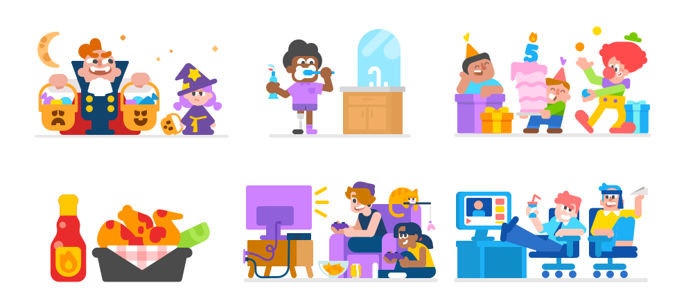
In Duolingo’s early days, only a few designers were capable of illustrating, so they were tasked with making hundreds of vocabulary illustrations, UI icons, and marketing materials every year. To speed up production, we moved to a minimalistic art style that was fast to produce without sacrificing design quality and clarity.
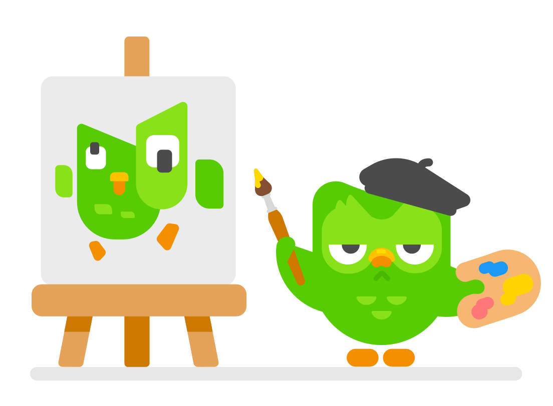
Switching to vector-based illustration software also helped speed up our pipeline. Initially, our art team painted hi-res pixel-based rasterized images for every illustration. Making the switch to mathematically calculated curves of vector-based illustration now makes it much easier to create illustrations that work everywhere: we can scale up and down for various phone and tablet screen sizes.
![]()
CLEAR TO UNDERSTAND
Because Duolingo is an education app, it’s crucial that learners understand what’s happening in the visuals. If visuals are unclear or misinterpreted, learners might answer incorrectly or not know how to navigate the UI. Our failure becomes our learners’ failure.
So we optimize the readability of our illustrations—that is, making it obvious what they’re supposed to be—by using the fewest details needed to get the point across. Not enough details, and learners might be confused. Too many, and shapes could be less readable at a glance and distract from the main point of the lesson. It’s all about finding the right balance.
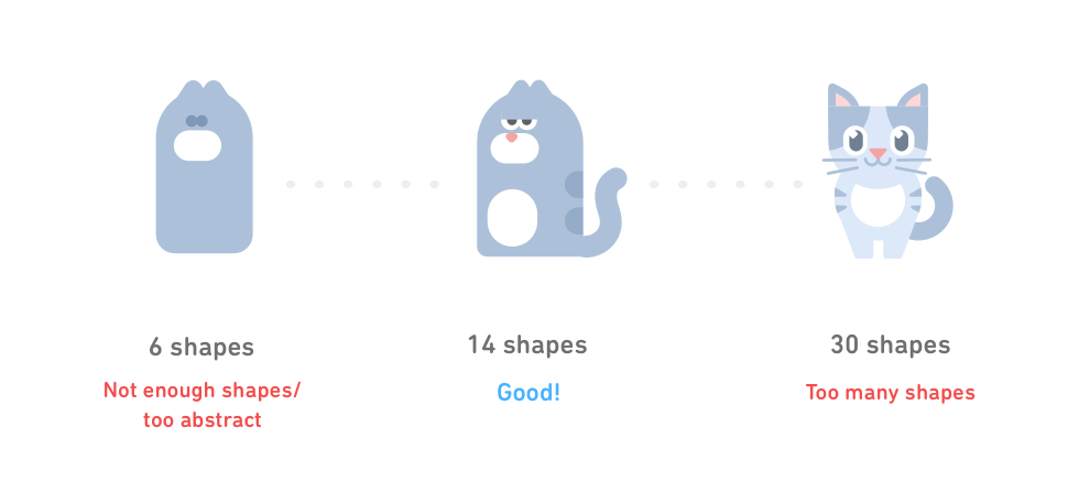
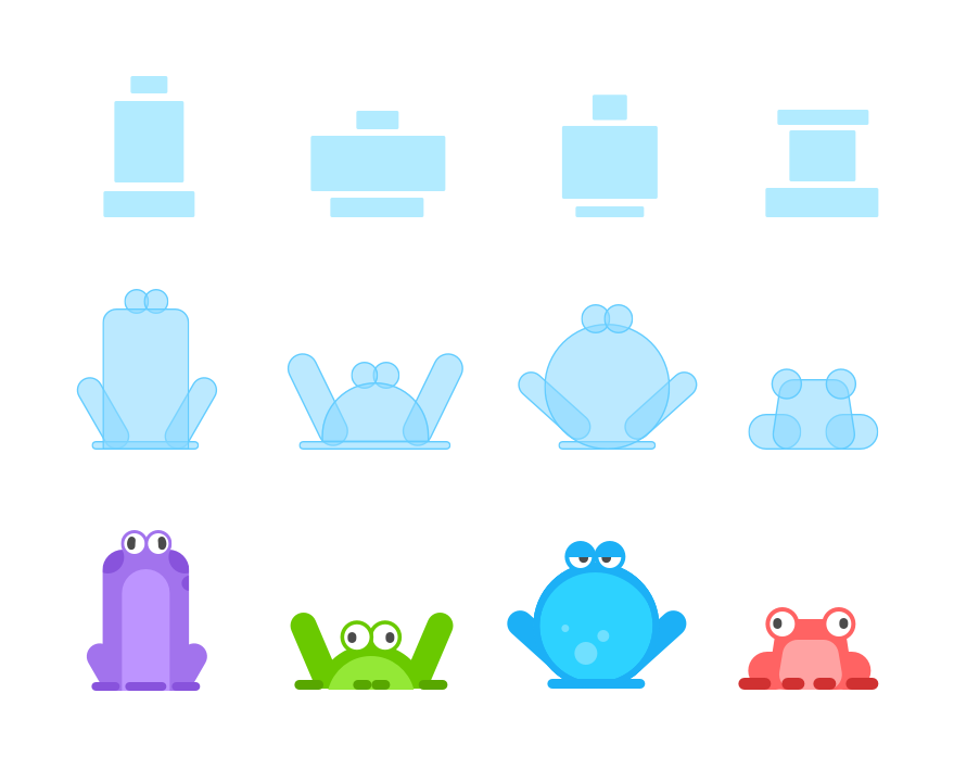
We know that, with the right colors and composition, the objects we need to illustrate can be clearly communicated with very few cleverly placed vector shapes.
Once we have those mission-critical shapes, we give them space in the composition to be clearly silhouetted—the first step to making the image easily recognizable.
Ultimately, our illustrations will live on a screen—sometimes a really small screen. So we make sure our artwork is framed with white negative space and constructed of clever, clearly recognizable details so each illustration enhances our learners’ app experience, and never interrupts it.
FUN TO LEARN WITH
At Duolingo, we believe that learning a language is easier when you’re having fun, and the entire company works to make the Duolingo app an inviting place to learn. For us artists, we use exaggeration, humor, and storytelling to make Duolingo’s playful personality felt in every illustration and animation.
CULTURAL CONTEXT
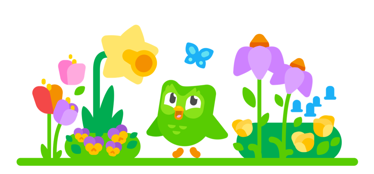
Part of learning a language is getting to know a culture—whether through the cultural values revealed in a language’s diction and syntax; or through other experiences like food and holidays, which our art team focuses on expressing through charming visuals that both entertain and educate. As our art director, Greg Hartman, says: “Our belief is that language learning is more than just words on a screen: it’s interesting characters, colorful experiences, and beautiful stories.” Visual expressions of food, art, and other cultural touchstones accompany the sentences we teach—keeping learners visually engaged with the culture as they gradually learn to speak the language.

EXAGGERATION & HUMOR
A big hurdle of language learning is getting over the fear of making mistakes. The Duolingo difference™ is the sprinkle of humor we add to make the app feel friendly. When the visuals are playful, the intimidation falls away, and learners actually look forward to coming back to practice every day.
So how do we make a Duolingo illustration funny? We consider the basic principles of character design, prop design, and storytelling to exaggerate key details almost to the point of caricature. Combine exaggeration with rhythm—using a strategic variety of shapes and sizes—and you have an illustration that’s instantly recognizable and worthy of a smirk or chuckle.
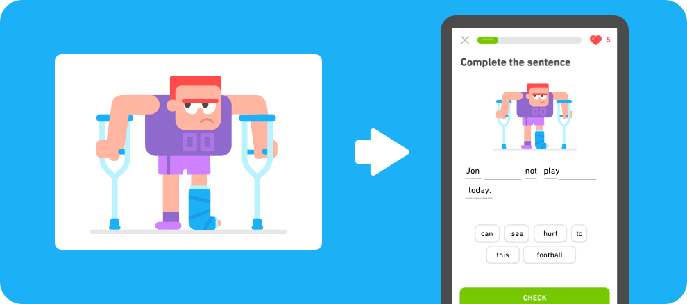
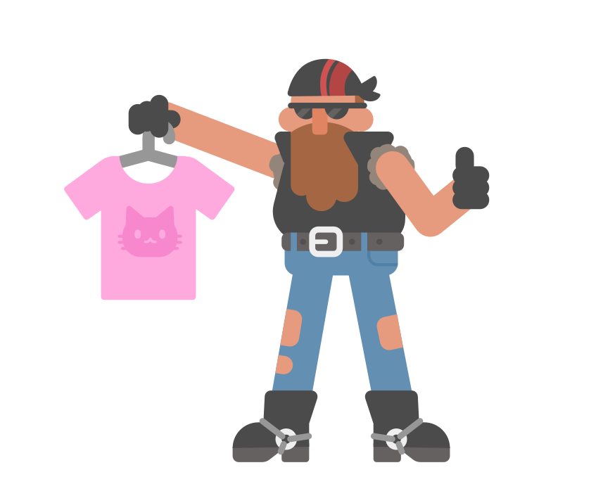
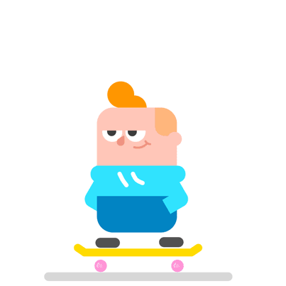
We also use exaggeration to dig up entertaining stories out of the sentences we teach. For instance, take the illustration below. We were asked to illustrate the sentence “I like this shirt.” Instead of illustrating a generic person holding a generic shirt, we thought, “What story can we tell with this sentence?” We started with a simple, unchangeable sentence and ended up telling a much quirkier story.
ATTENTION GRABBING
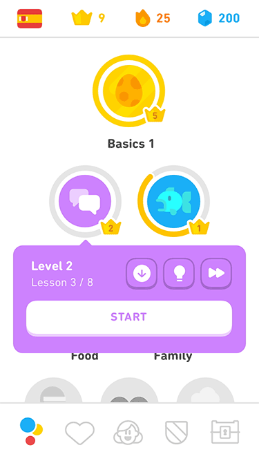
Illustration and animation help us guide our learners’ focus. To draw attention to UI or text on the screen, we rotate lines and angles in the artwork to direct the eye. Animation allows for even grander attention-grabbing, since the human eye naturally prioritizes looking at objects in motion. It’s a bit of a magic trick.
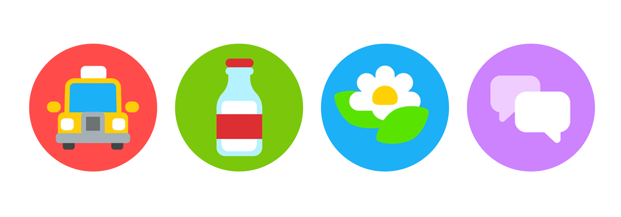
Take our animated skill icons. We decided to animate them to bring delightful movement to a high-ROI screen, but the icons wound up becoming valuable attention-grabbers themselves: learners spend more time watching the entire animation play through than they did quickly glancing at a static illustration. The longer we keep a learner’s attention, the more likely they are to start a lesson or follow prompts, which is good for our business and for learners as they work toward their goals.
ENTERTAINING AND EDUCATIONAL
Let’s face it: studying a new language can be overwhelming and intimidating. But by bringing visual delight to the app experience, Duolingo artists are helping learners stay entertained and committed to their language goals.
This is a huge and ongoing task, but having a defined art style, characterized by minimalism and playfulness, allows us to face big illustration and animation demands without sacrificing quality of design. With constant consideration for the needs of our learning content, our game mechanics, and our community, we can create visuals—and lots of them—that both entertain and educate.
As a Duolingo illustrator myself, I look forward to working alongside my fellow artists to discover even more visual strategies for helping you keep your daily streak!
Artworks in this post were made by myself, Greg Hartman, Kurt Hartfelder, Rachel Suggs, and Derek Gieraltowski