’Tis the season for reflecting on your achievements—and at Duolingo, we make sure those achievements are celebrated with a year-end experience we call “Year-in-Review!” What started as an end-of-year email has evolved into an essential in-app experience that provides learners with a personalized learning style and a look-back at their learning stats.
We know that learning a new language takes time and dedication, and we think that commitment should be rewarded! We hope the Year-in-Review is as delightful and rewarding for our learners to experience as it was for us to develop. Here’s a look at what goes into this end-of-year campaign!
Year-in-Review, in review
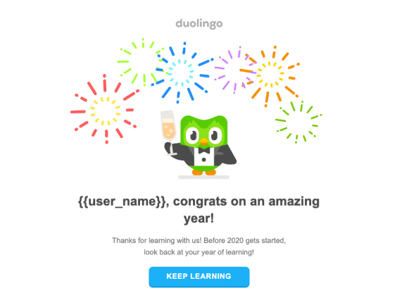
The Duolingo Year-in-Review experience has evolved *a lot* since its inception in 2019—back then, it wasn’t even in the app! When we developed the idea for a year-end experience, we thought a newsletter was the right format to help learners reflect on their learning journey and see their personalized learning stats.
In December 2019, we sent the newsletter to our users highlighting their active days, time spent learning, number of words learned, and number of lessons completed. It was our first attempt to send an email with this level of personalization at a large scale, and our users loved it!
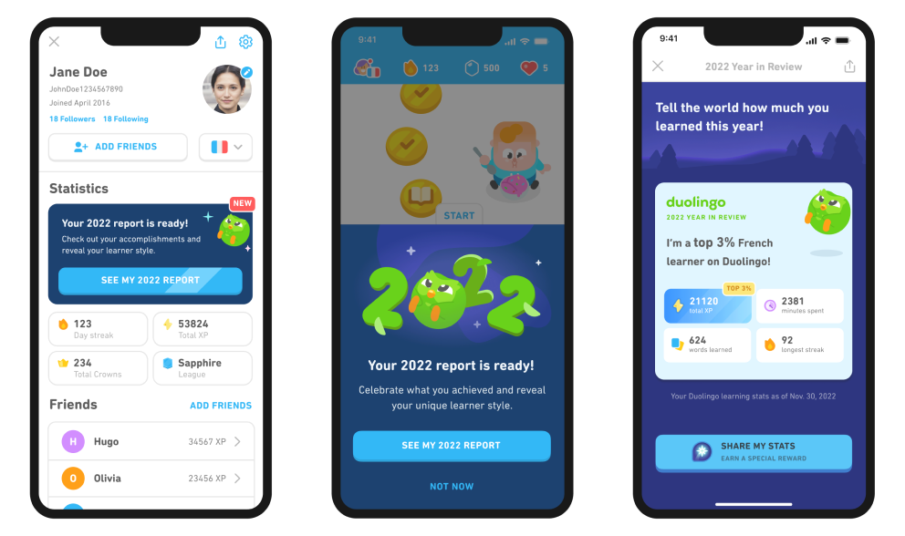
In 2020, we took the experience further by moving it into the product. For the first time, learners could access their individualized reports in the Duolingo app! They were also invited to share their stats on their favorite social platform.
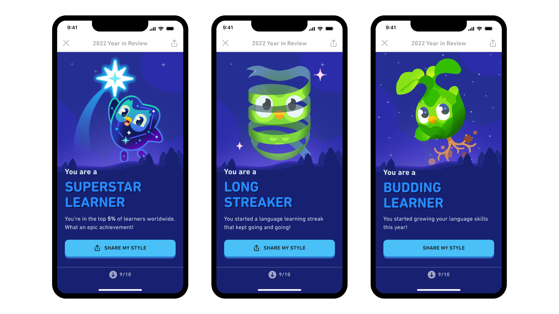
Since 2020, we’ve continued to evolve the in-app experience by adding more personalization, assigning each learner a unique learning style based on their behavior, and ensuring that the experience is so delightful that everyone wants to share it! One of the things we saw in initial versions of Year-in-Review was that learners loved sharing comparison stats—aka their XP percentile ranking. In 2021, we highlighted that stat in the share card, which increased overall share rates (especially for our top learners!)
Our 2020 data also showed that learners who ranked in the top 10% of XP earners contributed to more than half of the total shares for the project. We had to think of ways to make the experience more enjoyable for everyone, regardless of performance. That was one reason we created the learner styles—these unique “personalities” mapped to different app habits, and offered another opportunity for learners to share something about their year on Duolingo. This second share opportunity significantly boosted share rates!
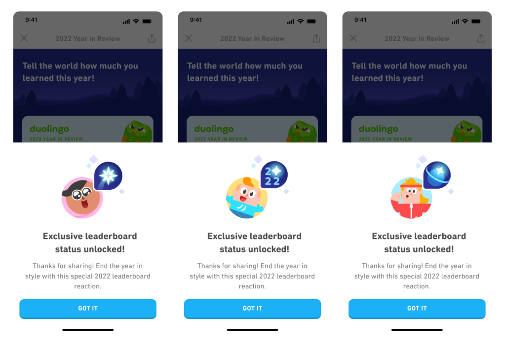
This year, we’ve added another layer: Leaderboard reactions! Learners who share their Year-in-Review results are rewarded with a special themed Leaderboard badge to reflect their learner style.
The biggest challenge: going global
One of the toughest challenges with the project is to create an engaging design that is executable by every culture across the globe. The design needs to be expressive and creative, but at the same time, it needs to work in different screen sizes, different languages, and across a range of markets around the world. During the creative ideation and product design stage, the team makes sure that the copy and illustrations are universally understandable and culturally appropriate. It’s a fine balance to strike!
The Year-in-Review experience is live in each of our 25 user-interface languages, and is the single largest project the localization team tackles each year! We start out with creative adaptations of the unique learner style names, coming up with multiple versions for each archetype and collaborating with regional marketing managers to identify what might resonate—even if it diverges from the English version. The names need to be equally fun, clever, and shareable, match the illustration well, and fit the limited space on-screen. We want learner styles that can cover the spectrum of study habits for learners on Duolingo, from those who are obsessed with their XP, to those who are devoted to their streak, to those who jump around from language to language.
After the learner styles are agreed on for each language, the localization team translates and closely examines each aspect of the experience, including every screen, share card, email, and push notification. A team of engineers helps to implement the myriad changes needed for it to look just as good in Bengali as it does in English.
This global effort is one of the most cross-functional projects at Duolingo, and involves Duos from joint effort from design, data, engineering, product, marketing, and localization as well as QA teams based in different work locations. It’s no small feat to ensure that all the stakeholders are staying on the same page across time zones!
Another successful year!
As we improve the experience, the metrics prove that this is an engaging and motivating campaign—we’ve seen a lift in lessons completed and time spent learning after learners flow through their Year in Review.
Millions of users share their Year-in-Review cards on social media, making #Duolingo365 a trending hashtag on Twitter every year. And, maybe most importantly: In 2021, we saw a significant spike in new users after we launched the campaign, which suggests that many people saw the Year-in-Review stats being shared across social media, and wanted to join the fun!
We’re so proud of this enormously successful campaign, and are already thinking of ways to make it more fun in 2023! Ready to see your Year-in-Review? Visit your profile page to see your 2022 report!